Final Portrait Draft
UX/UI CASE STUDY
This case study explores the process of creating illustrations for the Portrait of a Nevada Learner, a community-driven project aimed at reimagining education in the state. My role involved creating illustrations to reflect the Portrait's vision, and my involvement with the project has since expanded to include other designs.
Role: Illustrator
Skills: Illustration
Tools: Adobe Illustrator (Ai)
EMPATHY + Define
DEFINE PROBLEM
The Portrait of Nevada sought to reimagine education by empowering students and involving the community in the process. The Portrait required a visual identity that could effectively communicate its vision and engage the community, particularly young people, in the process.
DESIGN QUESTION
How can illustrations be designed to visually represent the Portrait's vision while resonating with students, educators, and the broader community?
SOLUTION
Using Design Thinking, I created abstract line illustrations that embodied the Portrait's Vision while resonating with students, educators, and the broader community.
UNDERSTANDING THE PORTRAIT
The Portrait of a Nevada Learner is a community-driven project focusing on empowering young people not only academically but also in their broader lives beyond school. The vision for the Portrait was driven by two questions:
1. What skills and mindsets do students need to succeed?
2. What is the role of schools in helping students build fulfilling lives and thriving communities?
These questions prompt the community to consider how education can empower young people to thrive outside of the classroom.
UNDERSTANDING THE BRANDING
Branding guidelines provided by the Portrait of a Nevada Learner.
SKETCHING
At the core of the Portrait was a community-driven effort to collaboratively shape the vision of education in the state. This collective spirit was reflected in the branding, which used the concept of sketching to represent the community's process of drafting and refining the Portrait.
ABSTRACT LINE WORK
Another fundamental aspect of the Portrait was the desire to reignite a passion for learning and teaching. It was important for educators and young people to have joy in education. The project was designed with educators, caregivers, and students in mind, centering young people in their education journey. The branding intentionally used abstract line art to represent youth.
IDEATE
The concept of abstract line work gave a lot of flexibility on what could have been created.
ONE LINE
Since the Portrait wanted to emphasize unity, I decided to use one single line to create the illustrations.
SWIRLS & LOOPS
To capture the joy that is in The Portrait I used a lot of swirls and loops. The Illustrations also used a lot of curves and rounded corners to make them more friendly.
The idea was to create illustrations where young people could see themselves.
PROTOTYPE
Sketches
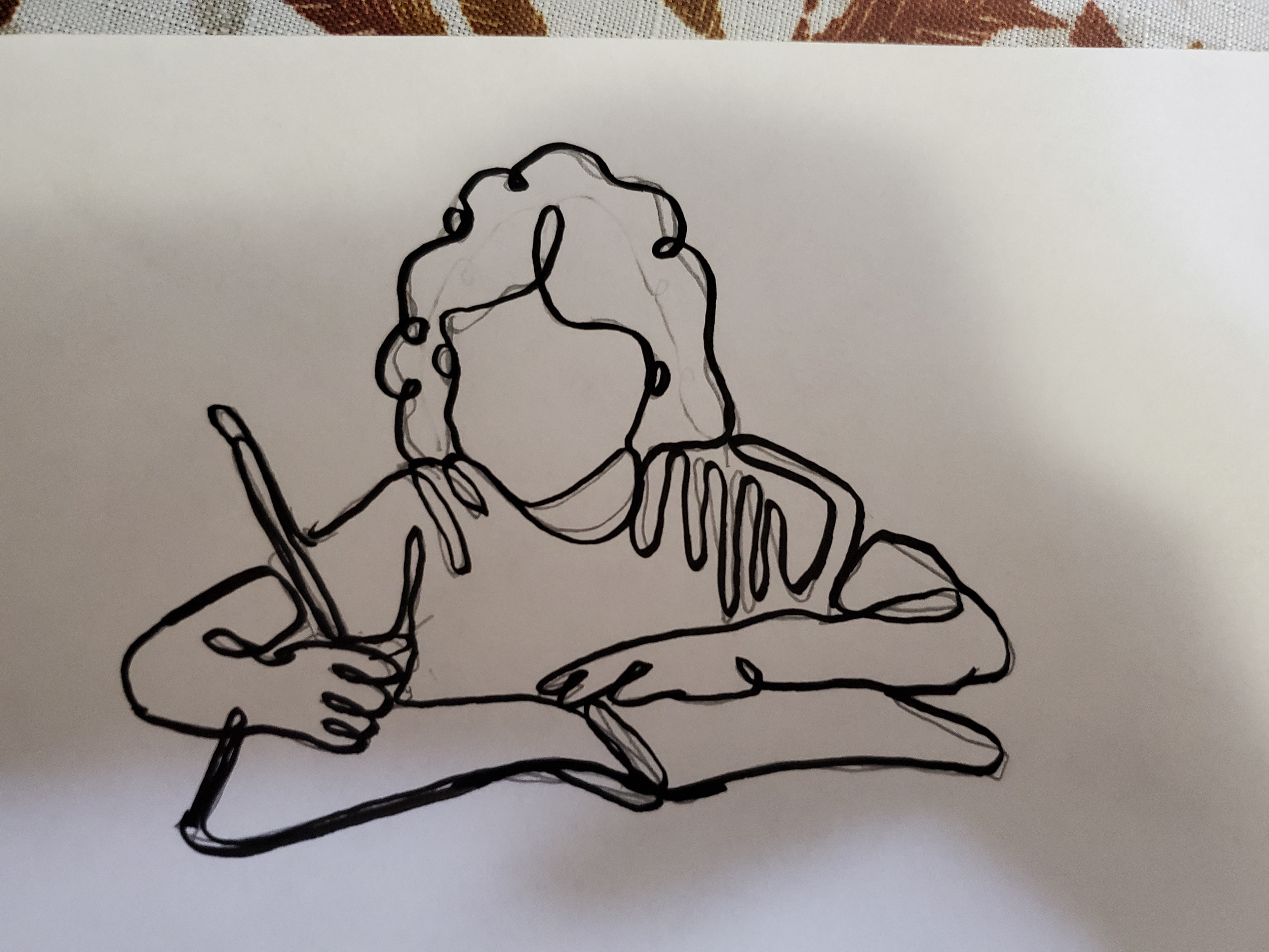
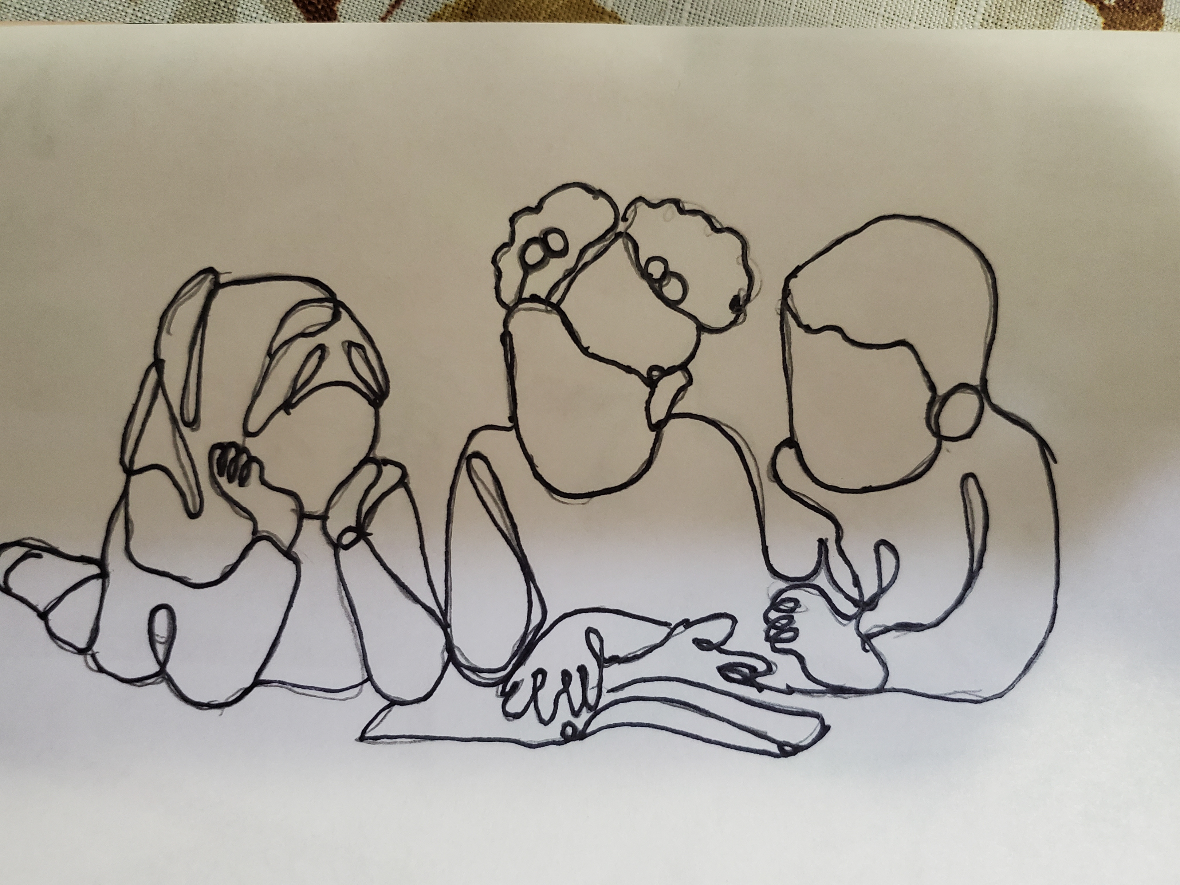
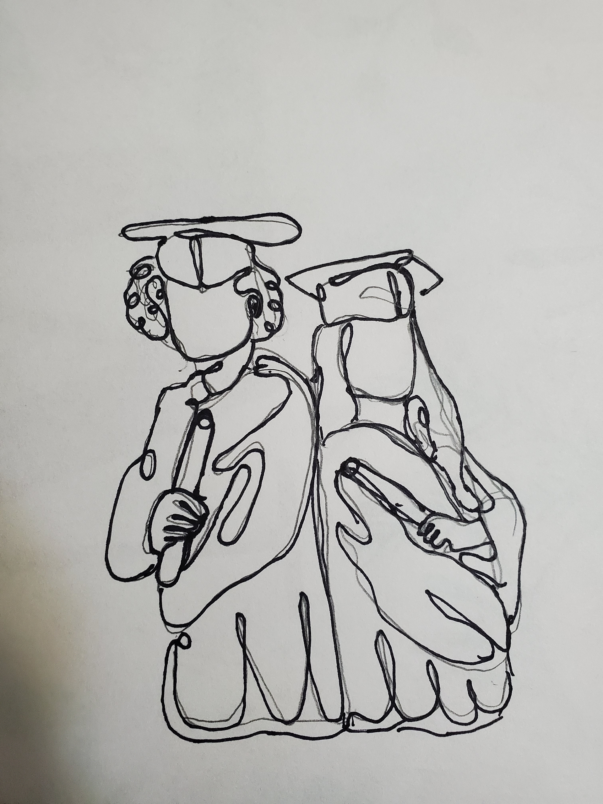
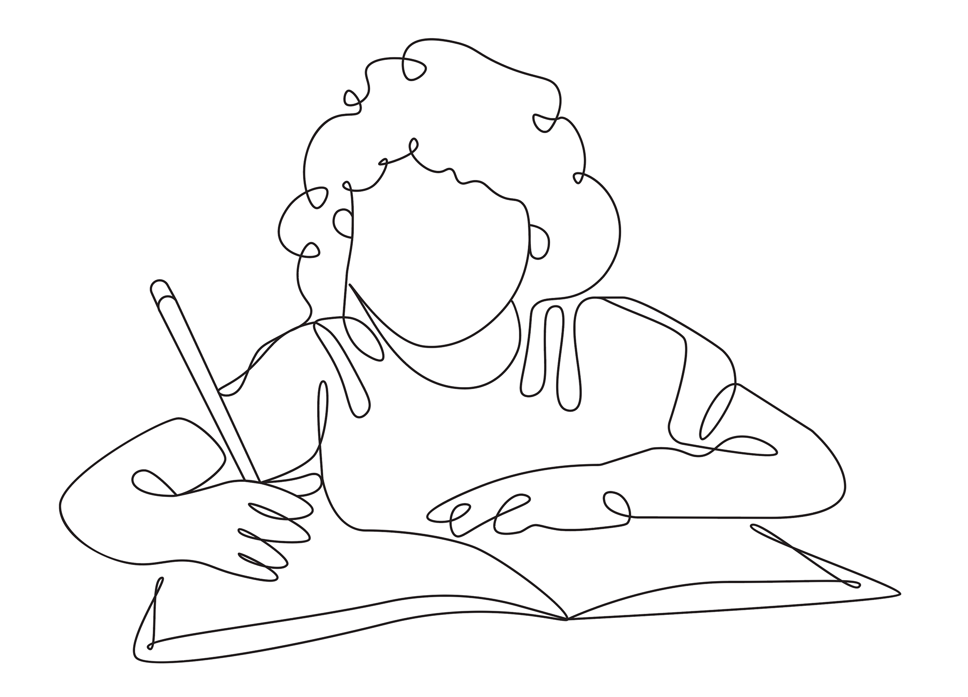
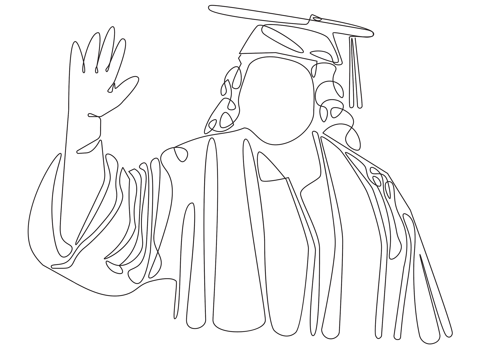
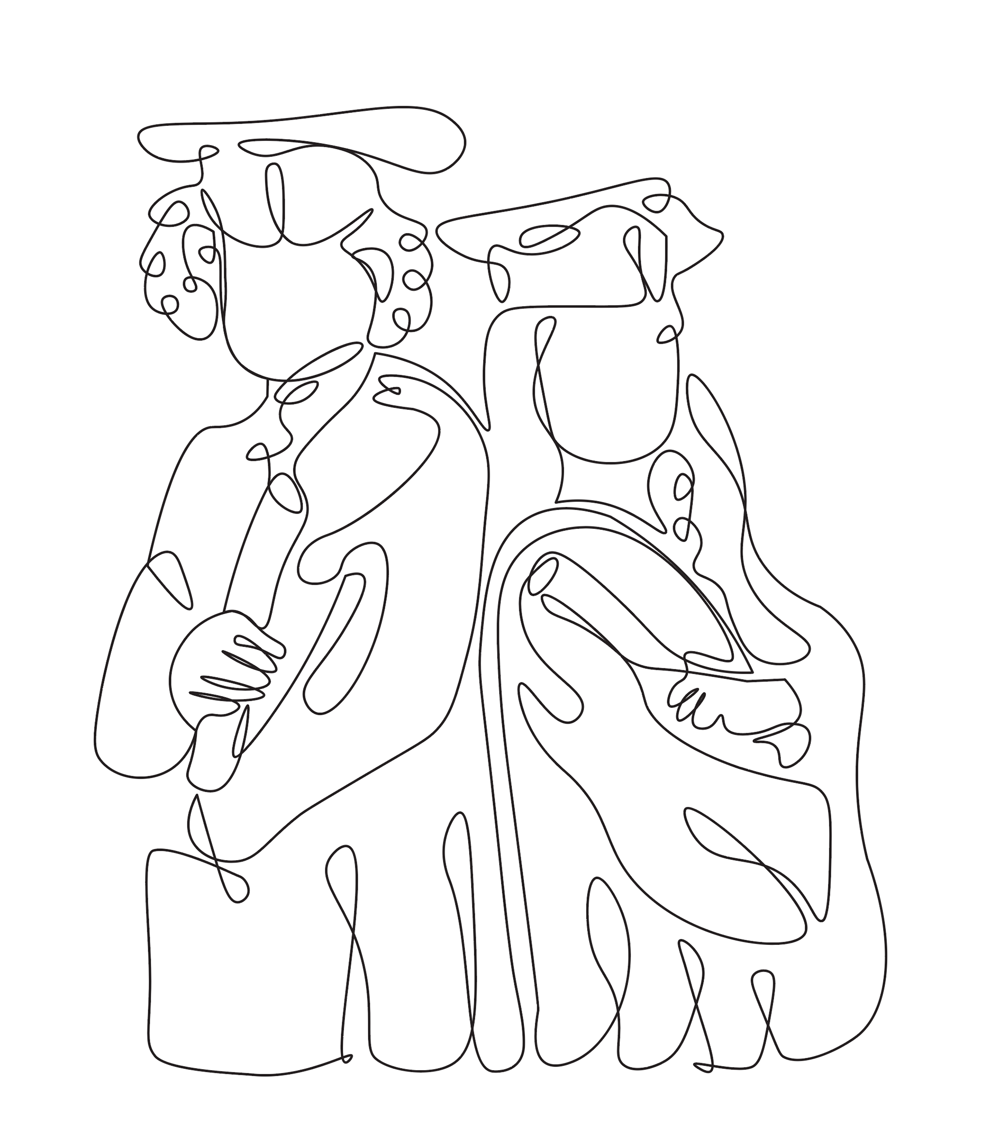
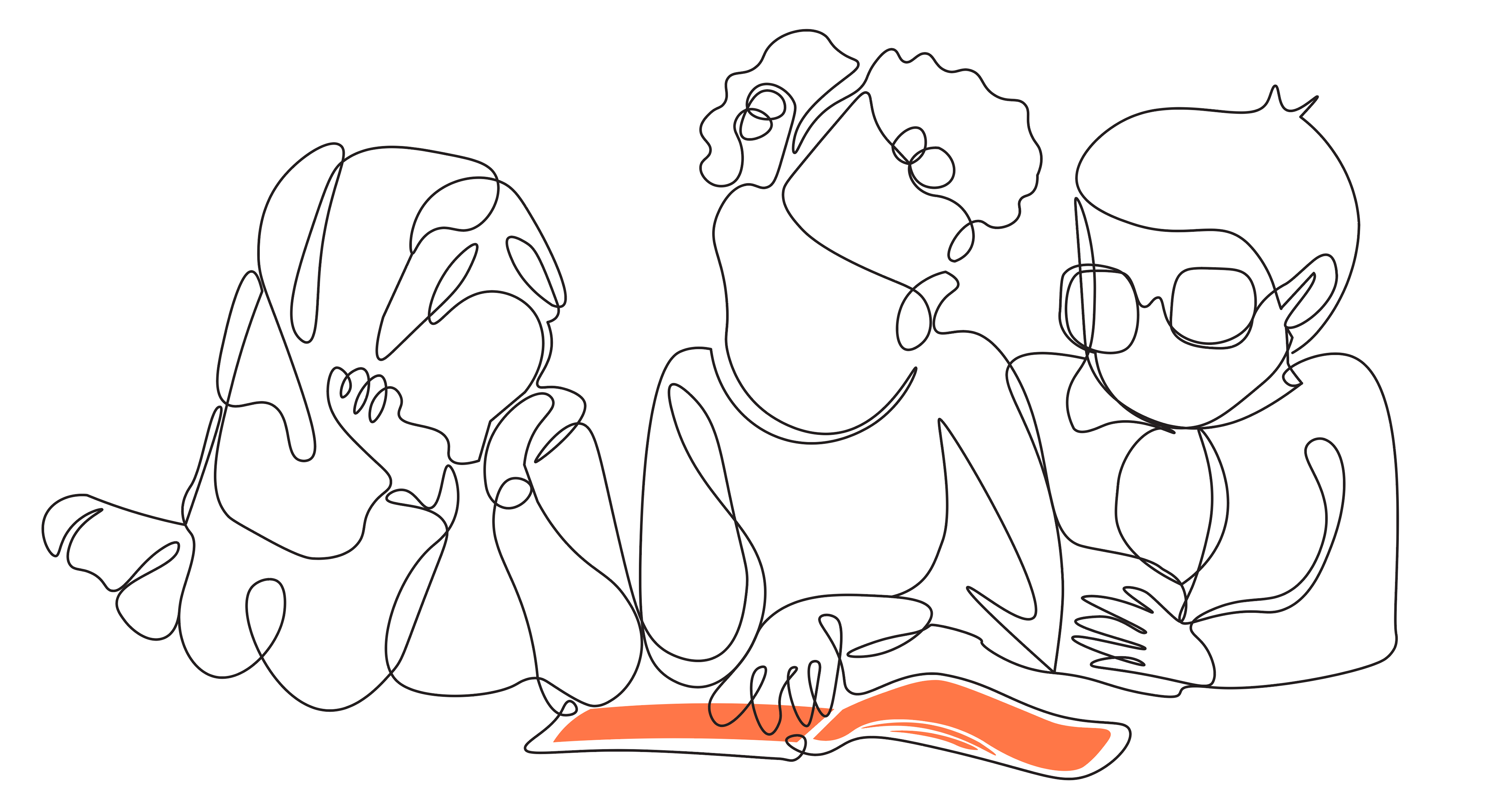
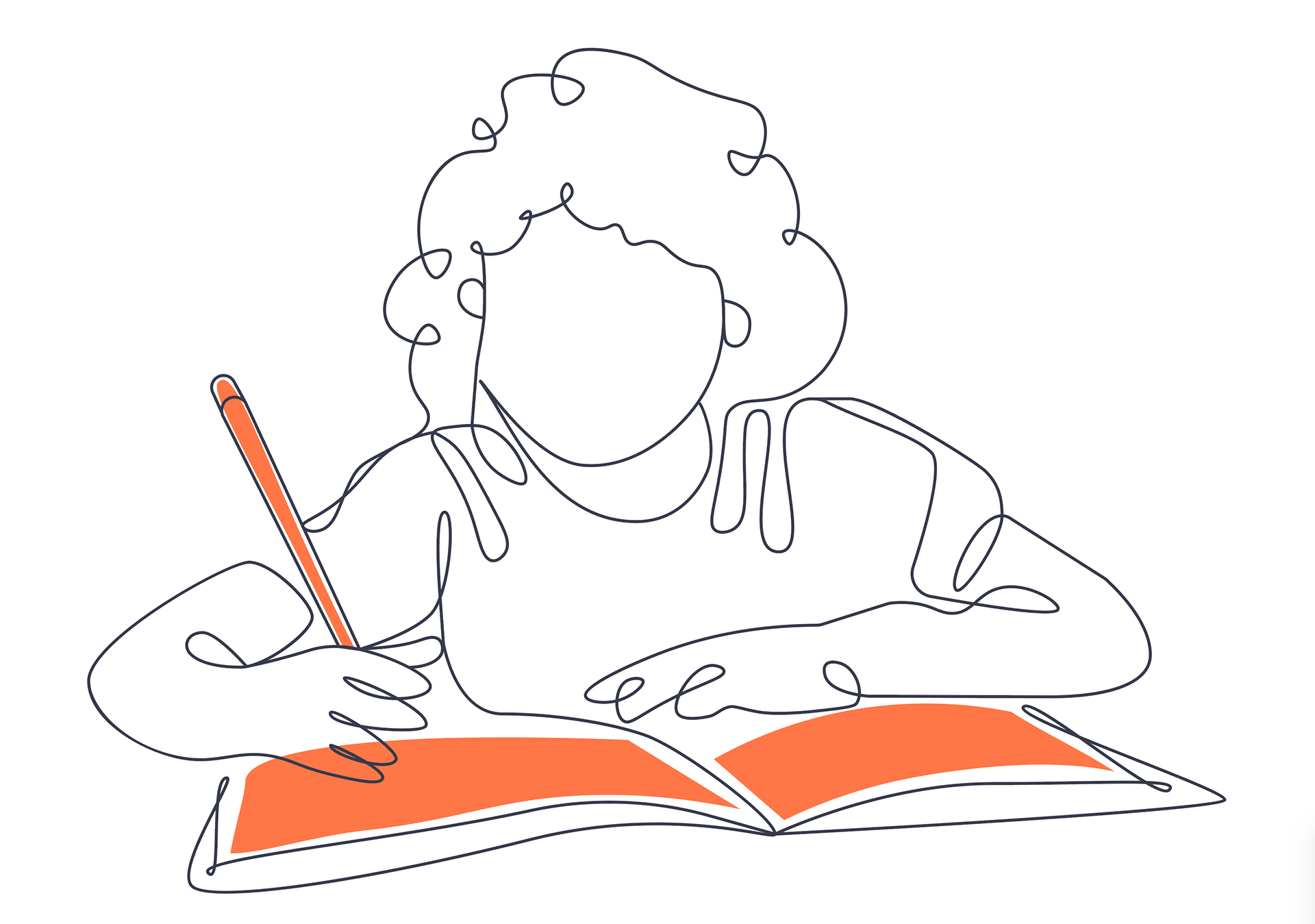
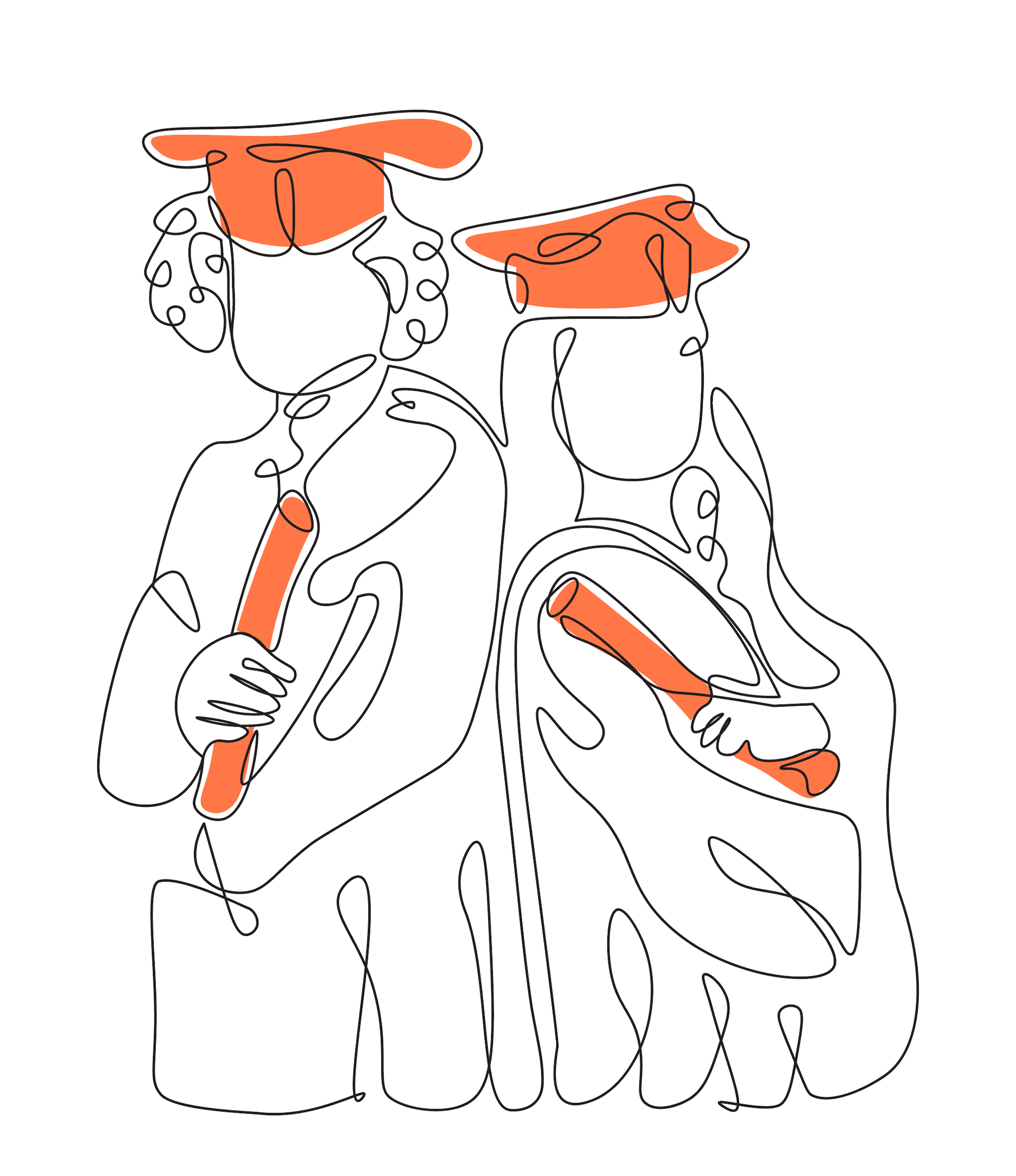
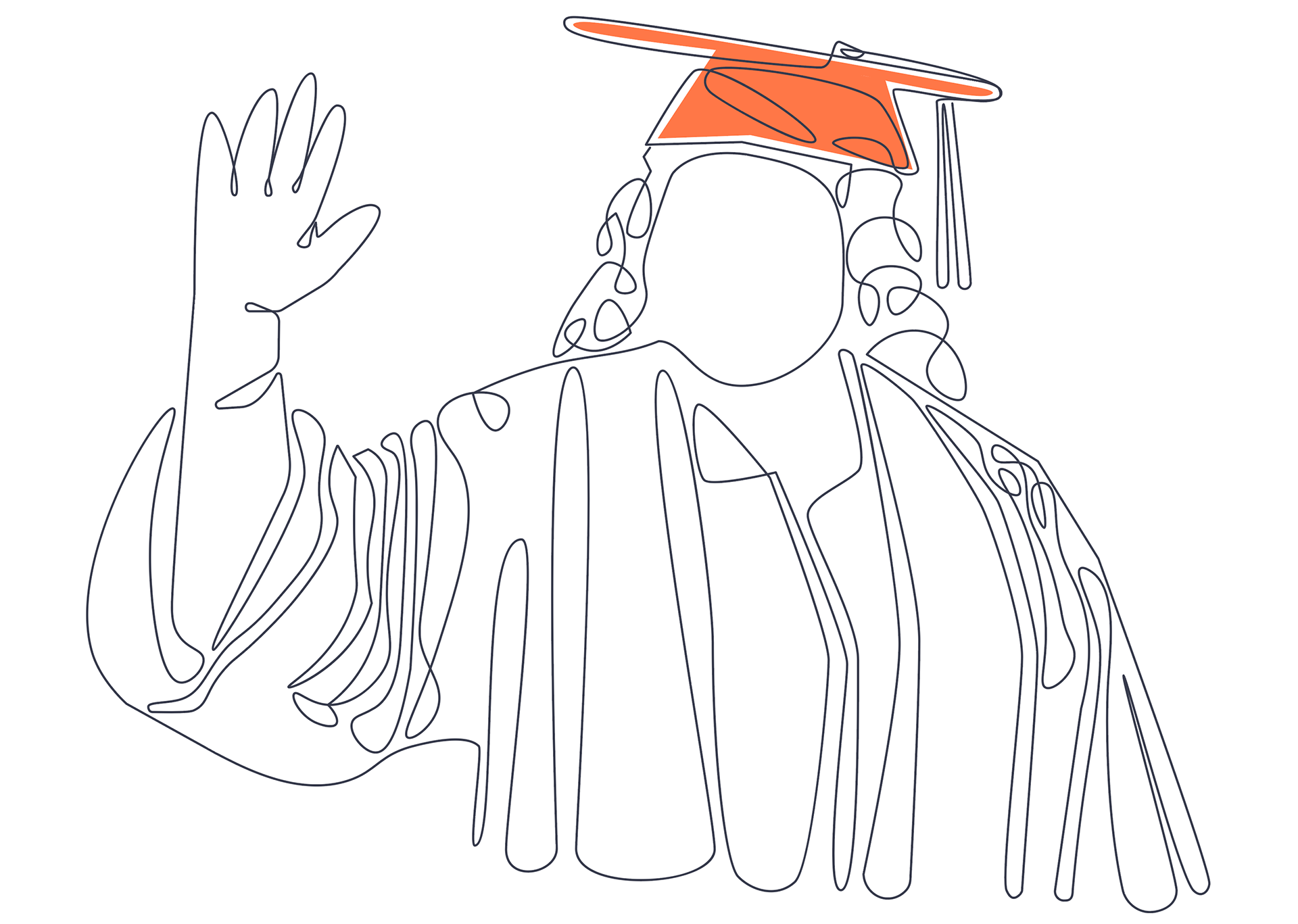
Four sketches were created aiming to depict young people in their diverse and dynamic nature— a group reading together, a young person writing in their journal, that same person graduating, and a pair of young people graduating.
FINAL DRAFTS
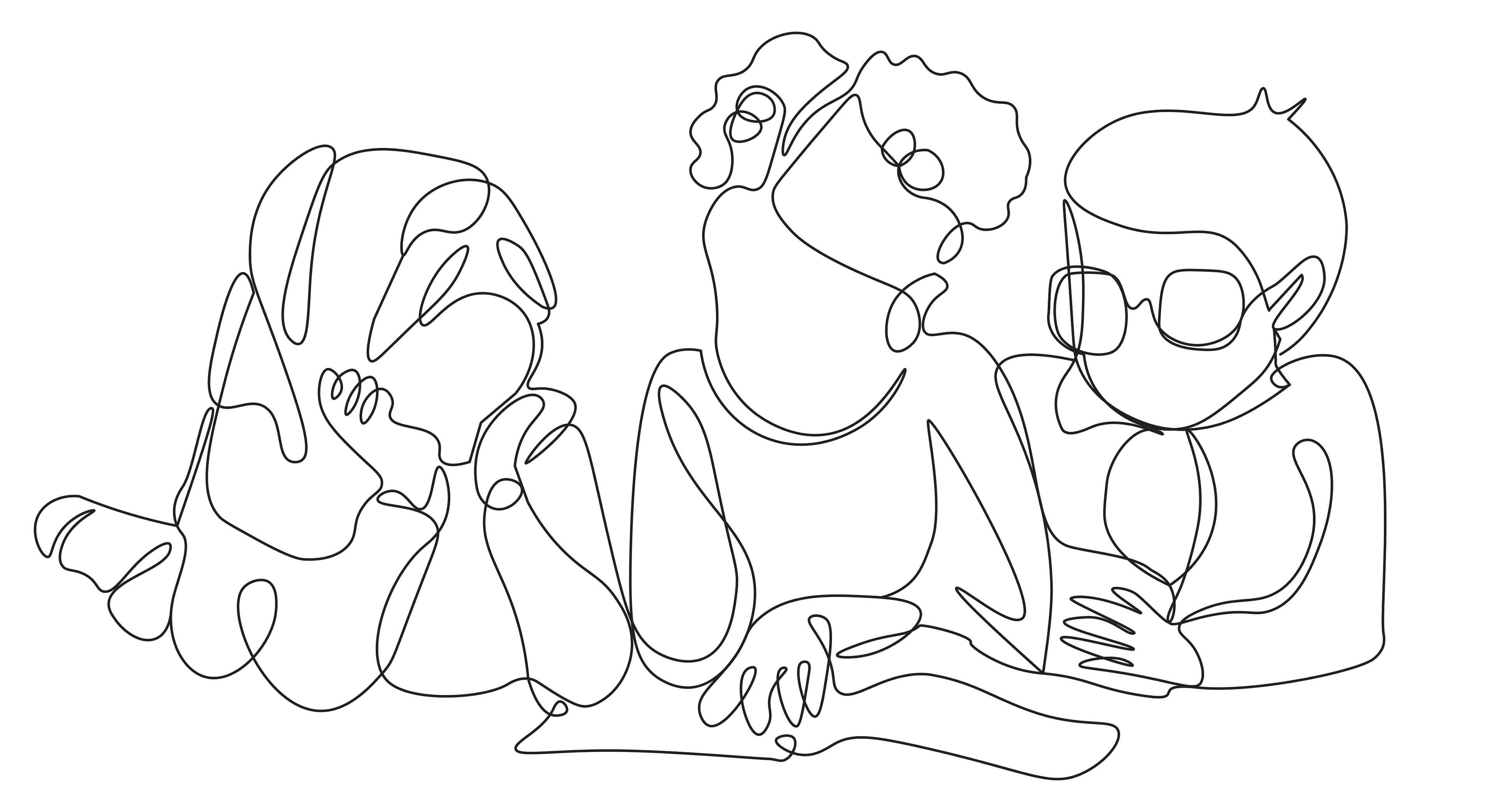
Four sketches were created aiming to depict young people in their diverse and dynamic nature— a group reading together, a young person writing in their journal, that same person graduating, and a pair of young people graduating.
Adding Color
In addition to having a solid line version, another version was created with color. The color orange was used to highlight artifacts on the illustrations.
Illustrations in action
Illustrations were not only used on the Portrait but throughout the Portrait artifacts to represent young people.
Illustrations used on the Portrait of a Nevada Learner website.
Illustrations used in the Nevada Future of Learning Network website.
TEST + FEEDBACK
Community feedback was very important to the Portrait project. I had been approached to create the illustrations because of community feedback and the need to have something more unique to the project.
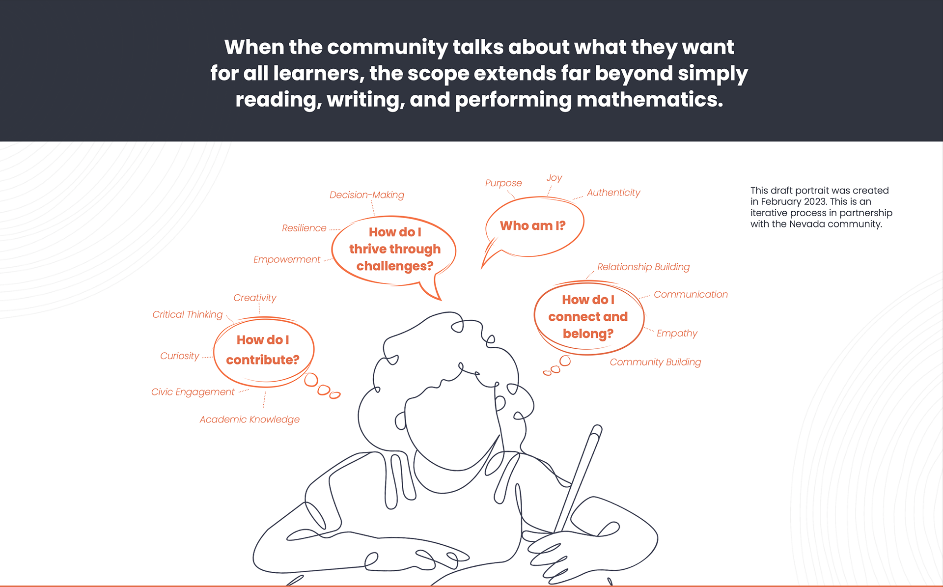
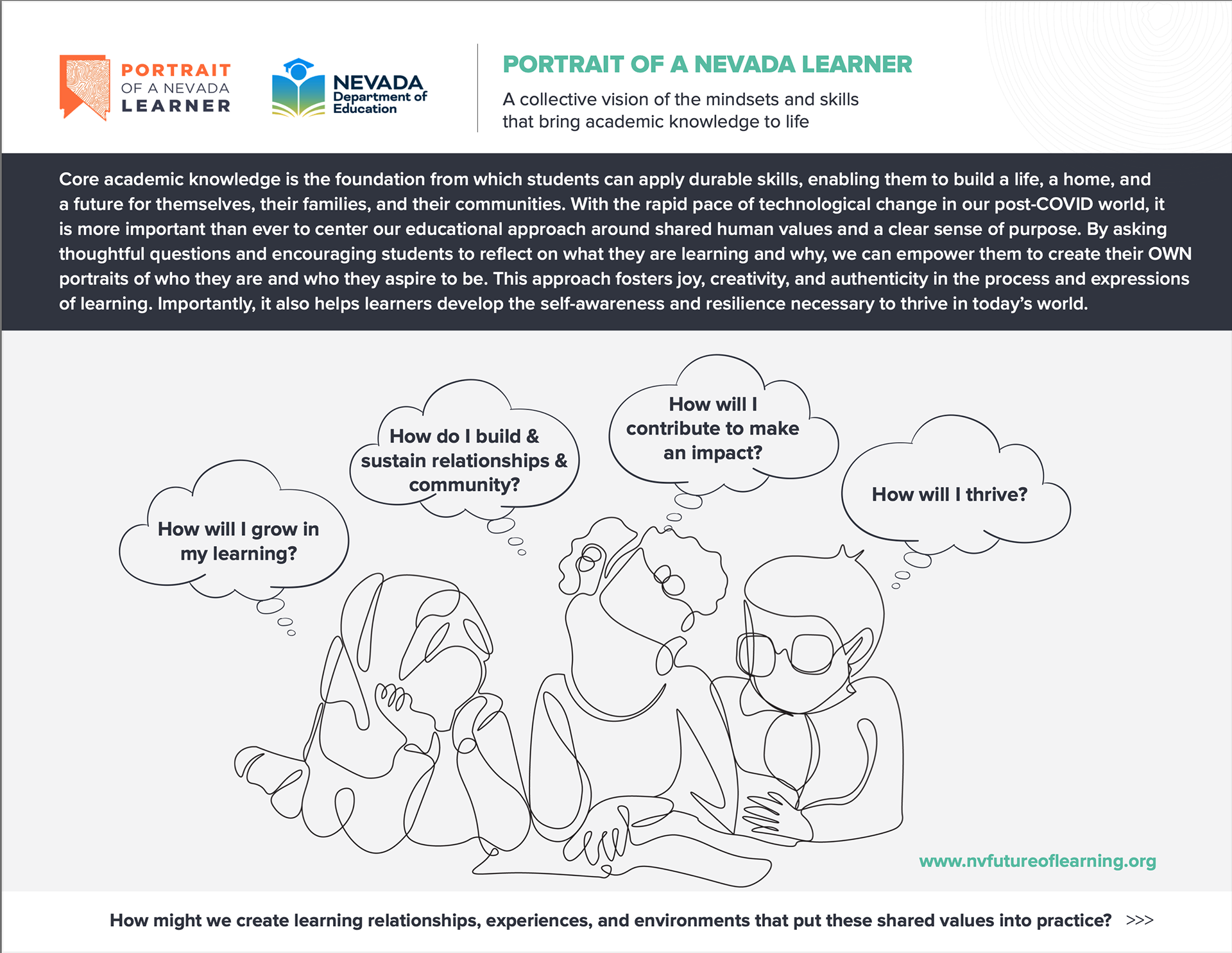
To the left, is the initial illustration used on the Portrait Draft. To the right, final illustration used.
The initial draft of the Portrait included the illustration with the young person journaling. But, after community feedback, I was approached to add more detail to the illustration with the three young people. In the feedback, it was pointed out how the three people showed relationships and community, which are traits of the Portrait.
Conclusion
Working on the Portrait of Nevada has been a rewarding experience. It not only allowed me to connect with my community but it reinforced my belief in user-centered design. Creating these illustrations was the beginning of my involvement with the Portrait. Last year, I got the opportunity to design large display booths to showcase the Portrait. This year, I designed a Postcard that asked community members to reflect on the Portrait.
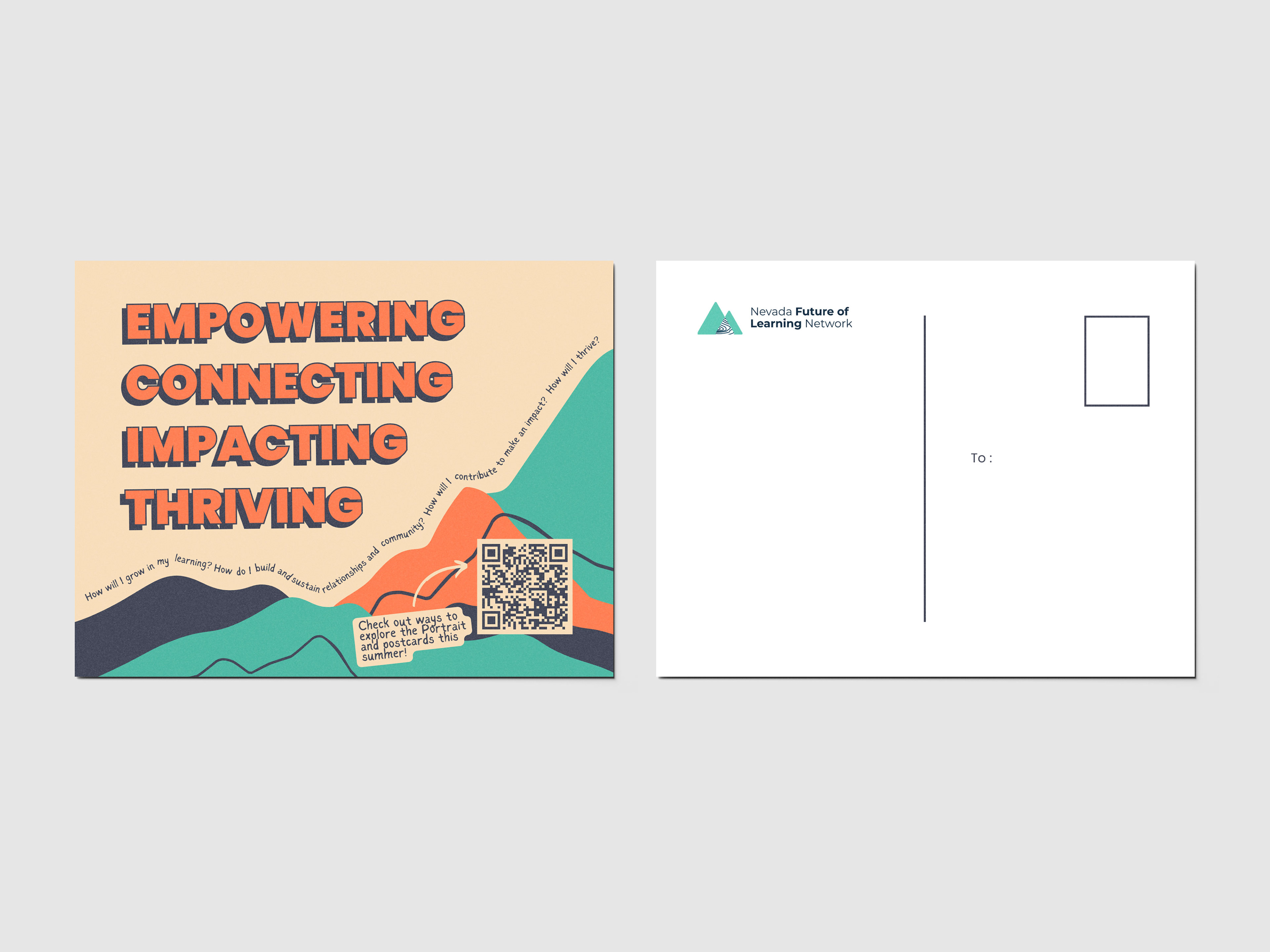
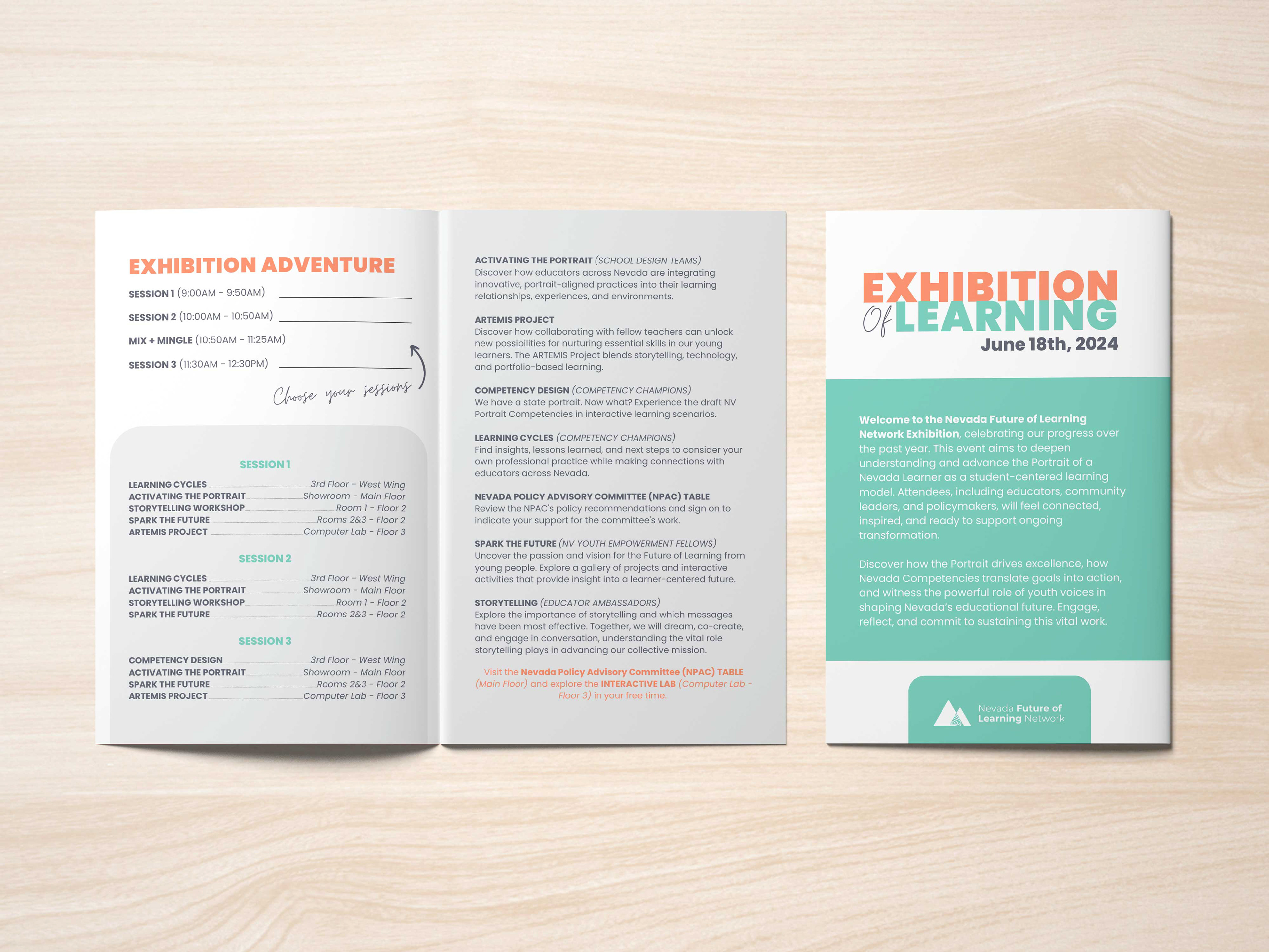
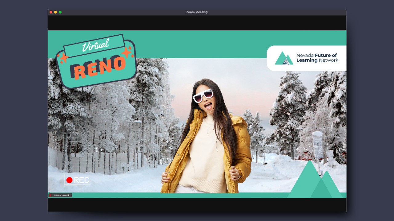
Other designs that I have created for the Portrait project, which has transformed into the Nevada Future of Learning Network.

