
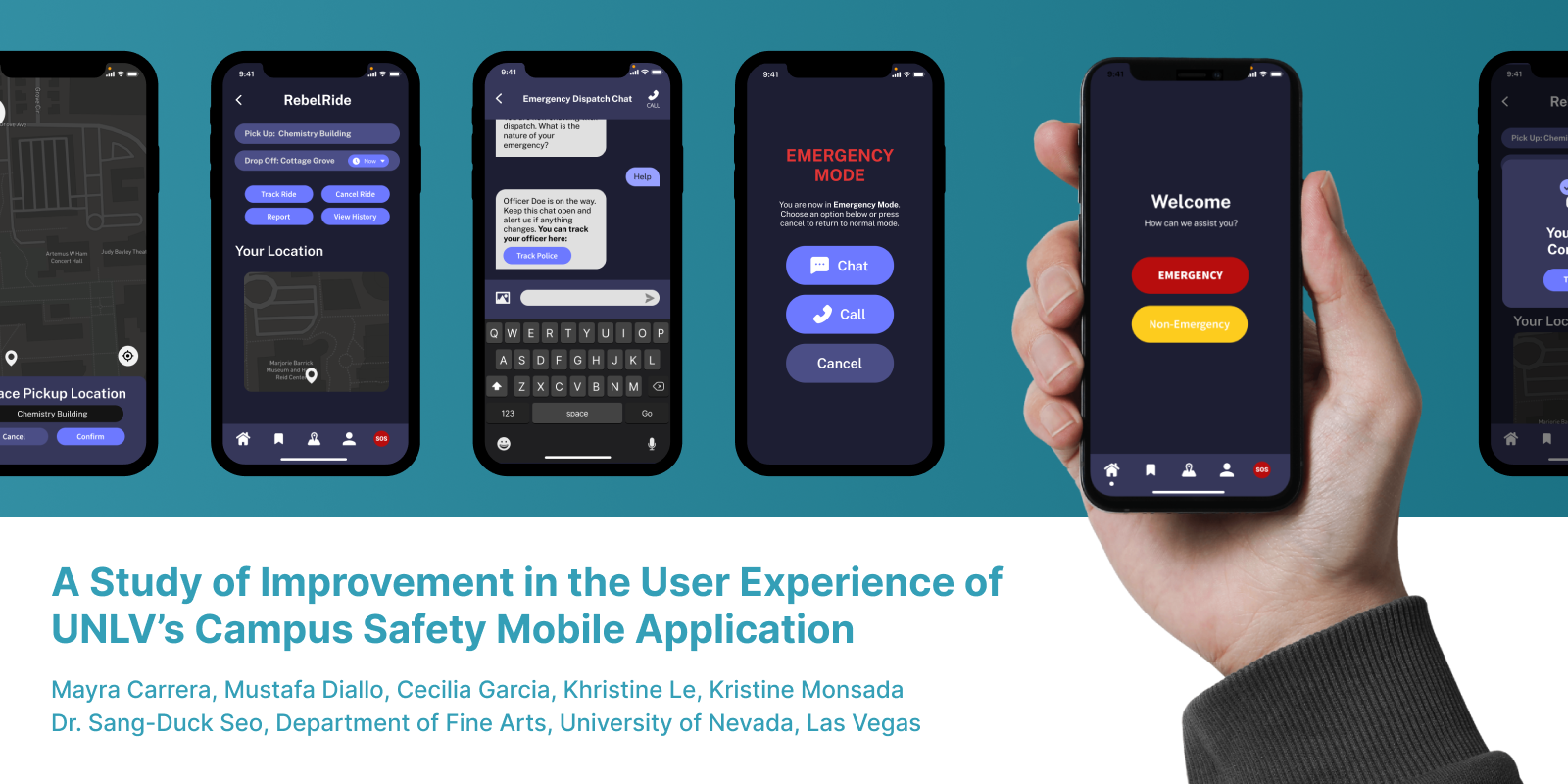
UX/UI CASE STUDY
Our study aims to evaluate the visual design and usability of the University of Nevada, Las Vegas’s (UNLV) campus safety app, RebelSAFE. There is little research related to how effective safety apps like RebelSAFE are in providing students assistance through emergencies. Through word of mouth from students, it is often mentioned that RebelSAFE plays an insignificant role in student’s personal safety. Our study aimed to increase the reliability of RebelSAFE among UNLV students. By constructing a better user interface (UI) to improve overall student user experience (UX), we aimed to develop an interface that prioritizes students’ needs to make them more inclined to use the app for safety.
PUBLICATION: A Study of Improvement in the User Experience of UNLV’s Campus Safety Mobile Application
Role: UX Researcher and Product Designer
Skills: Wireframing, Prototyping, Design Systems, Usability Testing, and UX research.
Tools: Figma, Adobe Illustrator (Ai), and Google Meets.
DEFINE
DEFINE PROBLEM
From word-of-mouth and personal experience, we knew that not many people knew or used the RebelSAFE APP.
DESIGN QUESTION
How can we increase the reliability of RebelSAFE among UNLV students?
SOLUTION
A new design would increase effectiveness and could positively impact the student body by ensuring that the new design of RebelSafe can help them when they are in danger.
EMPATHY
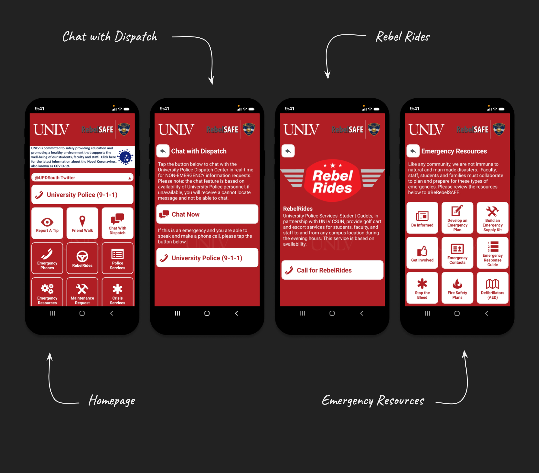
REBELSAFE APP
The current RebelSafe App consists of a crowded homepage, a call 9-1-1 feature, chat with dispatch, scheduling Rebel Rides or ridesharing, and many emergency resources. Overall it has many issues that make it hard to use for students and staff.
CONFUSING DESIGN
Too many icons on the homepage
Complex information architecture
COLOR USAGE
The color red symbolizes danger
Users feel overwhelmed
BROKEN/UNNECESSARY LINKS
Embedded links do not stay in-app
Inconsistent availability of safety services
INEFFECTIVE
Lack of Organization
Lack of Marketing / Advertisement
MARKET RESEARCH
To start our re-design we looked at what other emergency apps were in the market. Two that we looked at were Noonlight and Sekura. Noonlight is a safety application that notifies emergency contacts when a user feels unsafe. Sakura uses distractions and noise as a method to create a safe environment.

IDEATE
SOLUTION
For the redesign, we wanted to simplify the functions for users. One thing that stood out from Sekura and Noonlight was their simplicity. To do so, we focused on:
USER EXPERIENCE (UX) & USABILITY
Goal-oriented design
FUNCTIONALITY
Minimal design
SIMPLICITY
Intuitive and easy to navigate
ACCESSIBILITY
Easy access to necessary information
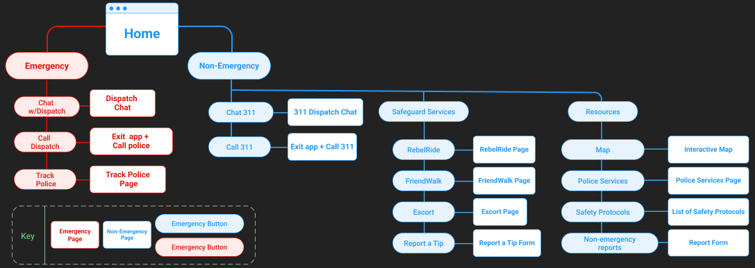
USER JOURNEY
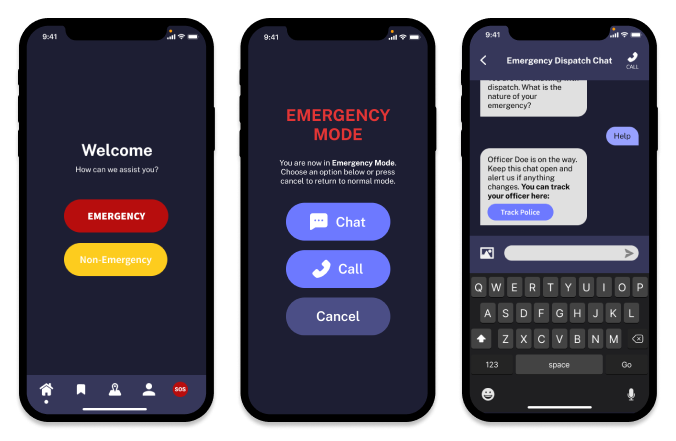
Since we wanted to simplify the user journey, we separated the user journey into "Emergency" and "Non-Emergency" features. This allowed us to focus the user journey on the two main uses of campus safety apps: emergency purposes and non-emergency purposes.
On the user journey map the red shows the Emergency Mode features and the blue shows the non-emergency features.
PROTOTYPE 1.0
LOW FIDELITY
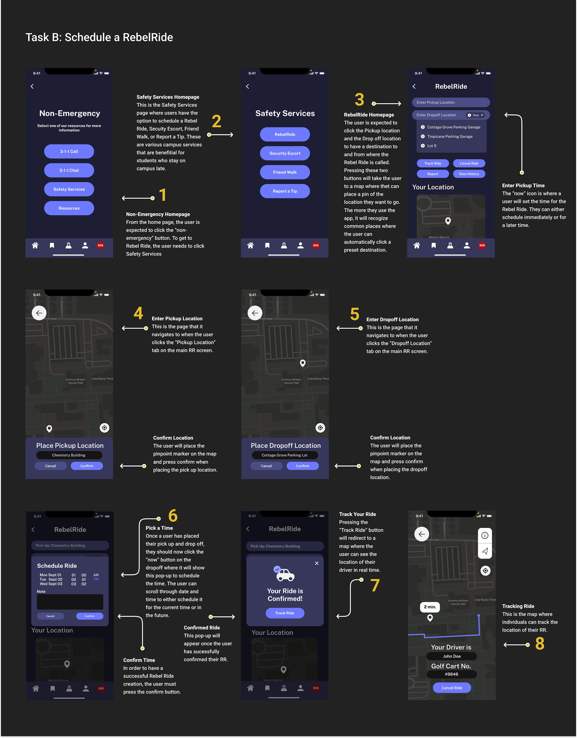
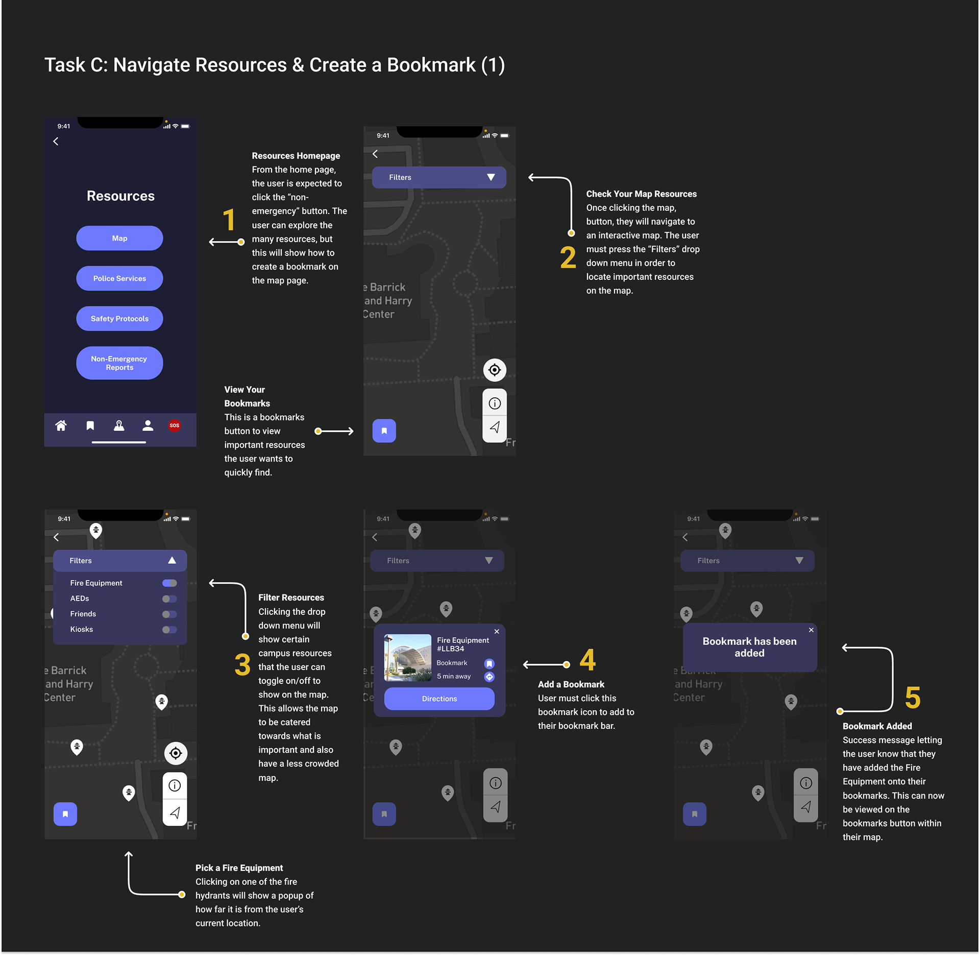
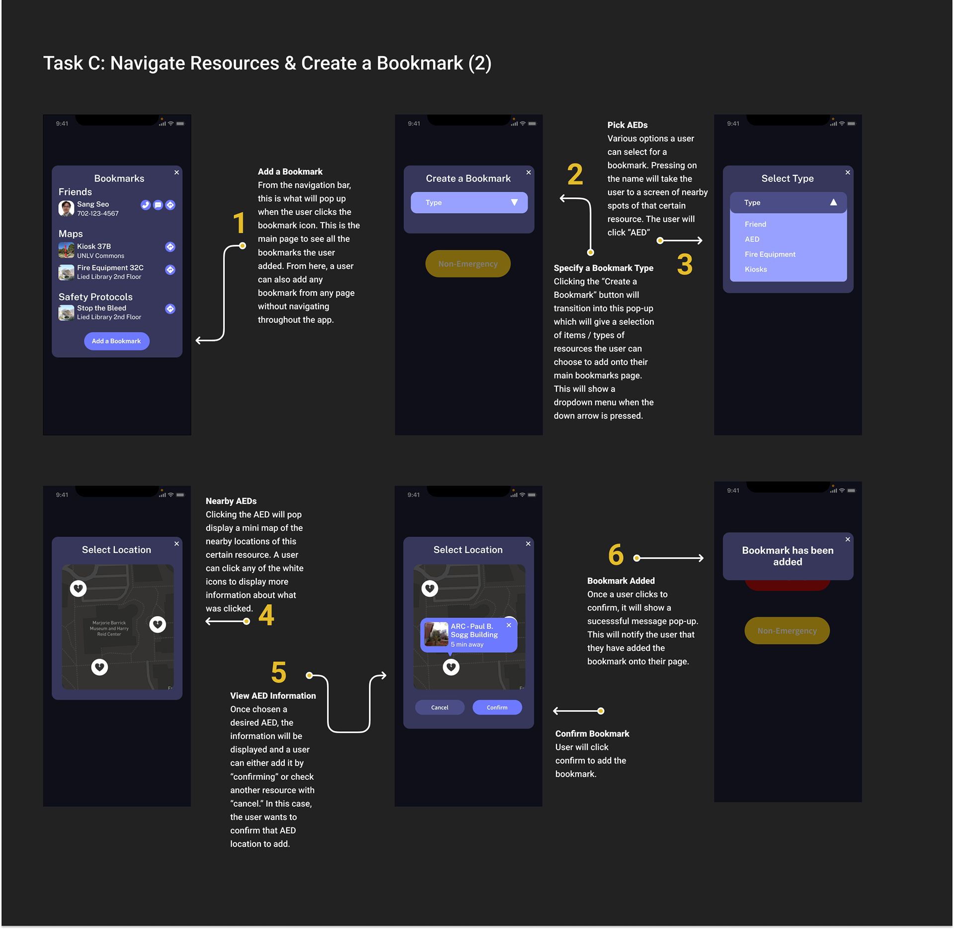
The redesign focused on three main functions of the RebelSafe app. These functions were divided into three main tasks for usability testing: contacting police in case of an emergency using the "chat with dispatch" feature, scheduling a Rebel Ride or campus rideshare, and bookmaking and saving features and resources for letter use.
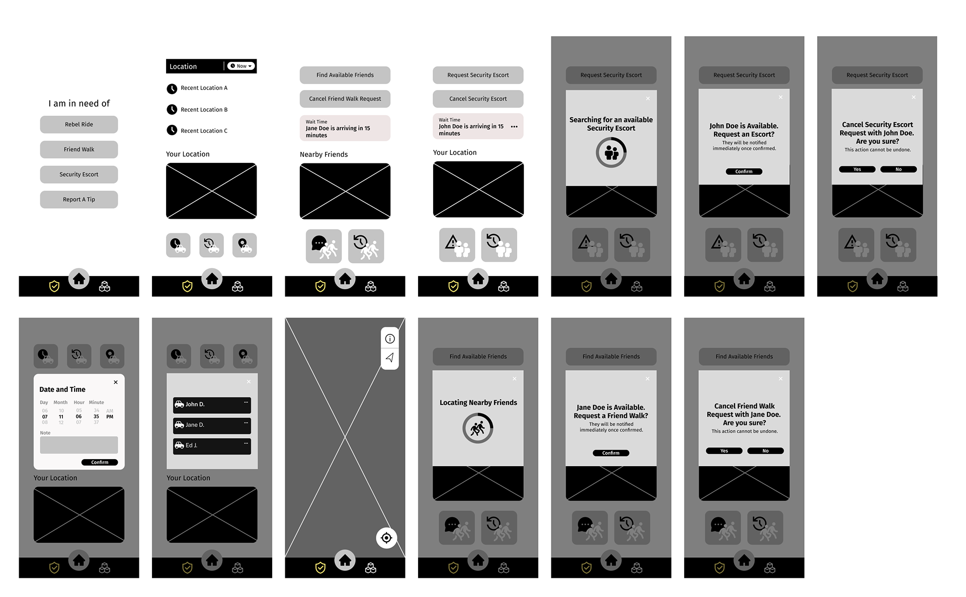
REBELRIDE

BOOKMARKS
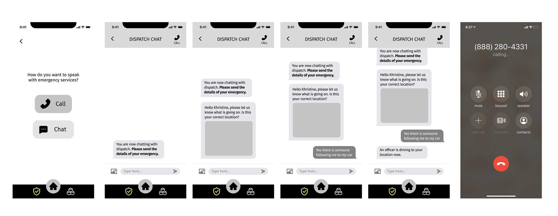
CHAT W/ DISPATCH
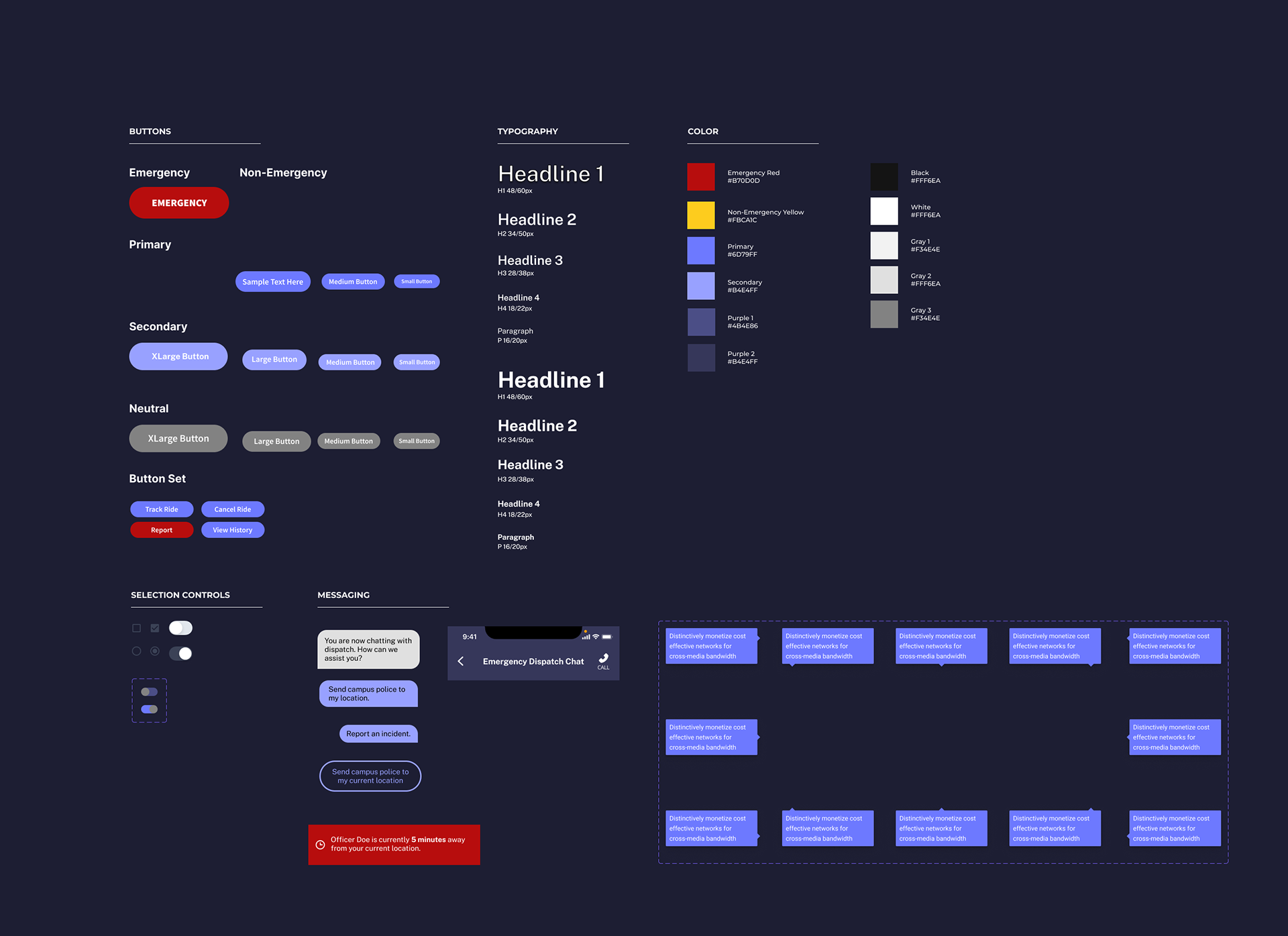
DESIGN SYSTEM
A design system was created to be used throughout the prototype for consistency.
TYPEFACE
San serif Public Sans typeface was used throughout the design
because of its clear readability and various weights.
because of its clear readability and various weights.
DARK MODE
Dark mode was used for dangerous situations since it tends to emit less light.
It has also been found to be more comfortable for users to use in dark environments
COLOR SYMBOLISM
YELLOW for warning and caution
RED for danger and emergency
PURPLE for calmness and complement other colors.

HIGH FIDELITY
TASK A
Chat with Dispatch Feature
(Situation) You are in danger on campus and there is no one around you. You need to reach out to the campus police. However, it may be difficult to speak on the phone right now because you are trying to stay hidden. Using the RebelSafe mobile app, try to contact the UNLV police and type out ‘HELP’ to inform them you’re in danger.
TASK B
Schedule a Rebel Ride or campus rideshare
(Situation) You had to stay late on campus due to your schoolwork. You are trying to get to the parking garage but you are afraid to walk there by yourself. Using the RebelSafe mobile app, try to request/schedule a Rebel ride.
TASK C
Bookmark useful features for future use
(Situation) You want to find out what campus safety resources are available and where those are located. Using the RebelSafe mobile app, try to find all safety resources. And bookmark the most valuable resources for your future reference.

USABILITY TESTING
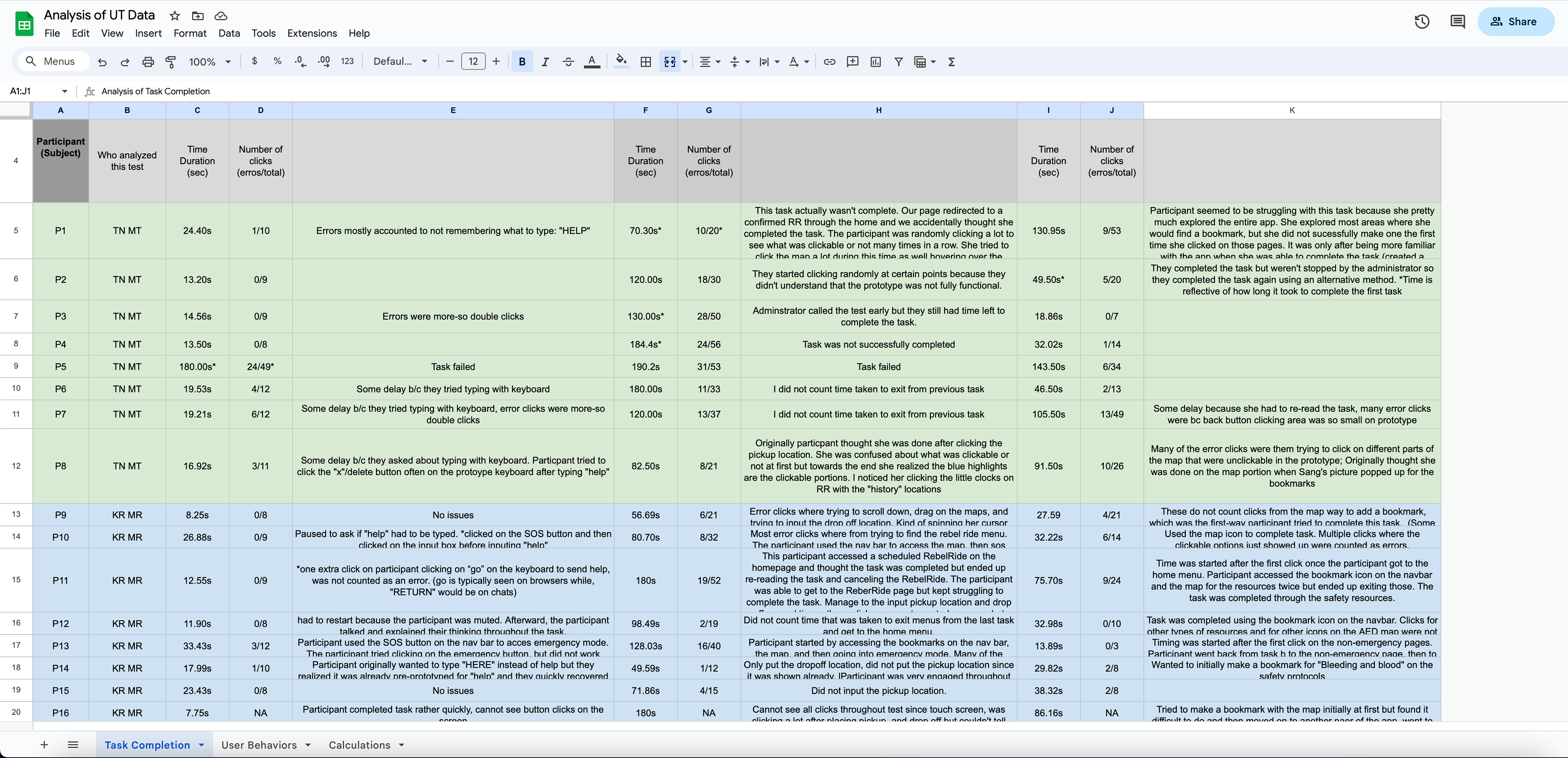
Usability Testing was conducted to evaluate the redesign of RebelSAFE. Participants were asked to conduct three tasks. Behaviors, user interactions, and participant feedback were recorded. The prototype was tested on UNLV Fine Arts students who had personal experience being on campus near the campus' Alta Ham Fine Arts(HFA) building or Grant Hall (GRA) building after 5 p.m. 16 students were recruited in total. Usability testing was conducted virtually through Google Meets.
FINDINGS AND OUTCOMES
We found that of our participants, 81.3% did not use the RebelSafe app. The reasoning behind why participants did not use the app included its ineffective app design, poor service quality, and finding no use for the services. Meanwhile, 56.3% of participants rated campus safety as a 2 out of 5, 25% rated safety as a 3 out of 5, and 18.75% rated it as a 4 out of 5. In addition, 12.5% rated the GRA and HFA building security at a 1 out of 5, 37.5% rated security at a 2 out of 5, 25% rated it at a 3 out of 5, and 25% rated it at a 4 out of 5.
TASK SUCCESS
After all, 16 tests were conducted, we proceeded to data analysis. This data included time taken, completion success, the number of error clicks made, and the number of total clicks made for each task.
TASK A
Average Time to Complete: 21.54 seconds
Average Error Clicks: 3 Error Clicks
Total Clicks to Complete Task: 12 Total Clicks
Pass Rate: 93%
TASK B
Average Time to Complete: 84.61 seconds
Average Error Clicks: 13 Error Clicks
Total Clicks to Complete Task: 32 Total Clicks
Pass Rate: 68.75%
TASK C
Average Time to Complete: 56.70 seconds
Average Error Clicks: 5 Error Clicks
Total Clicks to Complete Task: 20 Total Clicks
Pass Rate: 100%
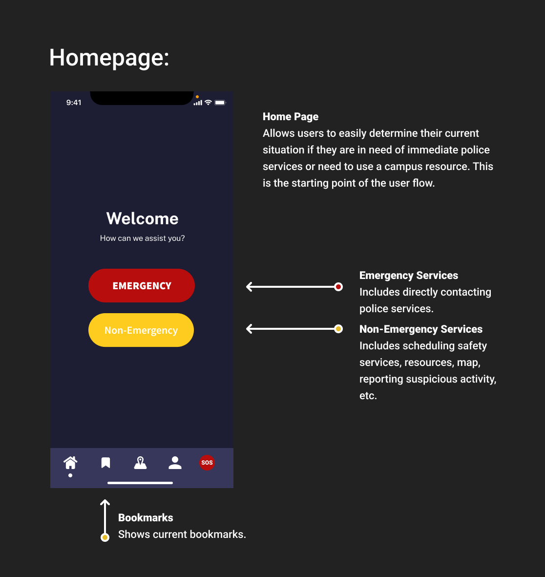
HOME
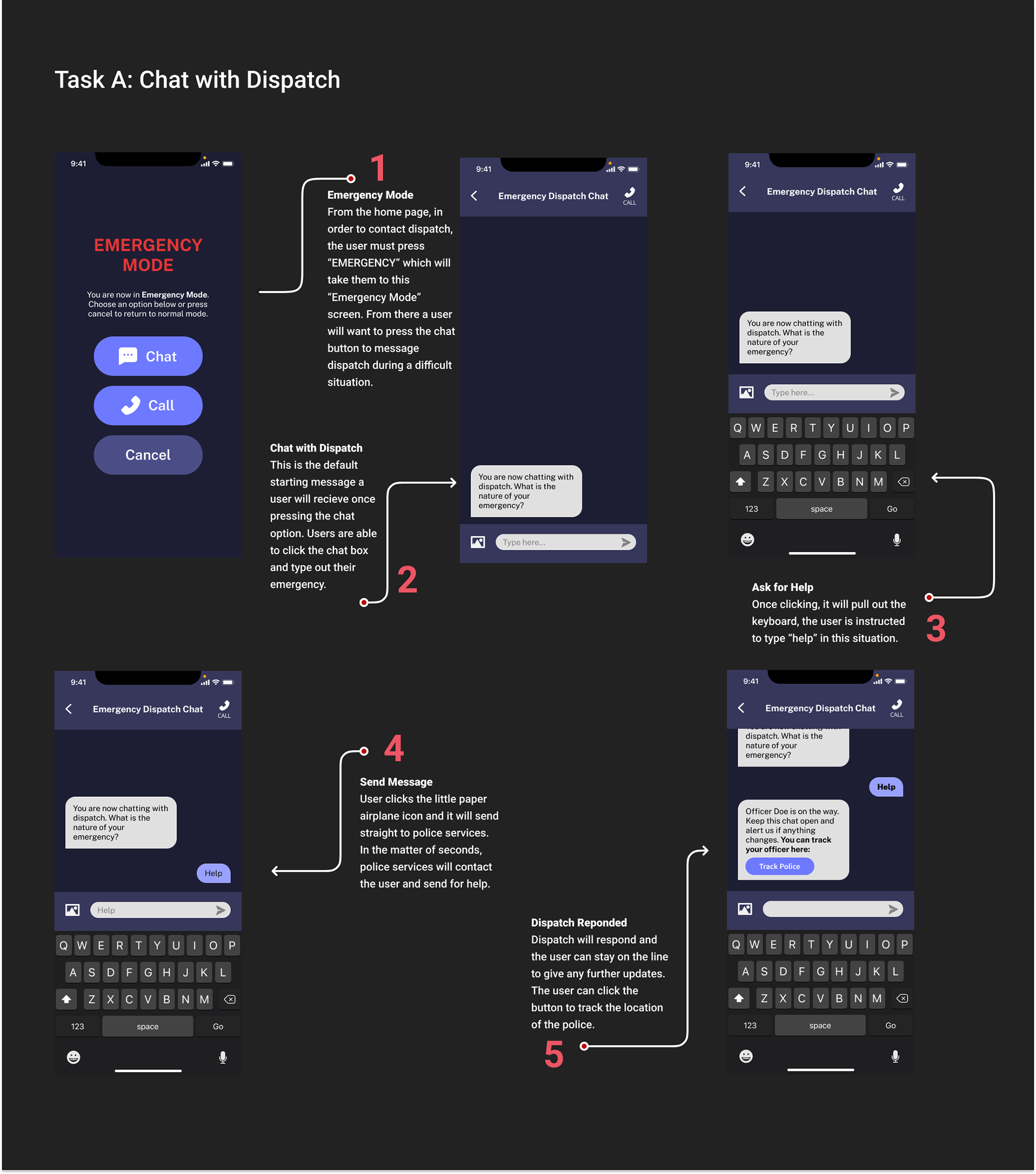
DISPATCH
REBELRIDE
BOOKMARK 1
BOOKMARK 2
PARTICIPANT FEEDBACK
Specific behaviors in participants such as visual or audible frustration/confusion were observed and recorded, alongside any part of the tasks that participants struggled with. In Task B, about 93% of users expressed confusion and nervousness such as squinting, moving closer to their screens, and/or verbally asking questions. In Task C, roughly 25% of users expressed confusion or nervousness.
VISUAL HIERARCHY
Participant admitted to not reading buttons or fine print and tried to conduct their task as instinctually as possible. This trend allowed us to identify the lack of hierarchy in the design of the user flows that made it difficult for users to progress.
NON-ESSENTIAL FEATURE
Participants felt that Task C, having to do with bookmarking, was a non-essential feature. As a result, it was agreed to remove this feature in our second redesign and shift focus primarily on further improving the safety features.
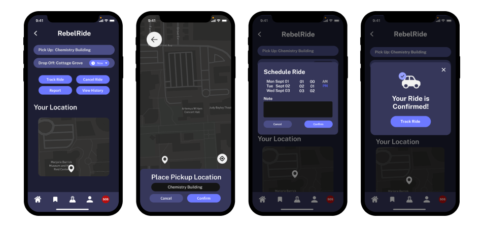
PROTOTYPE 2.0
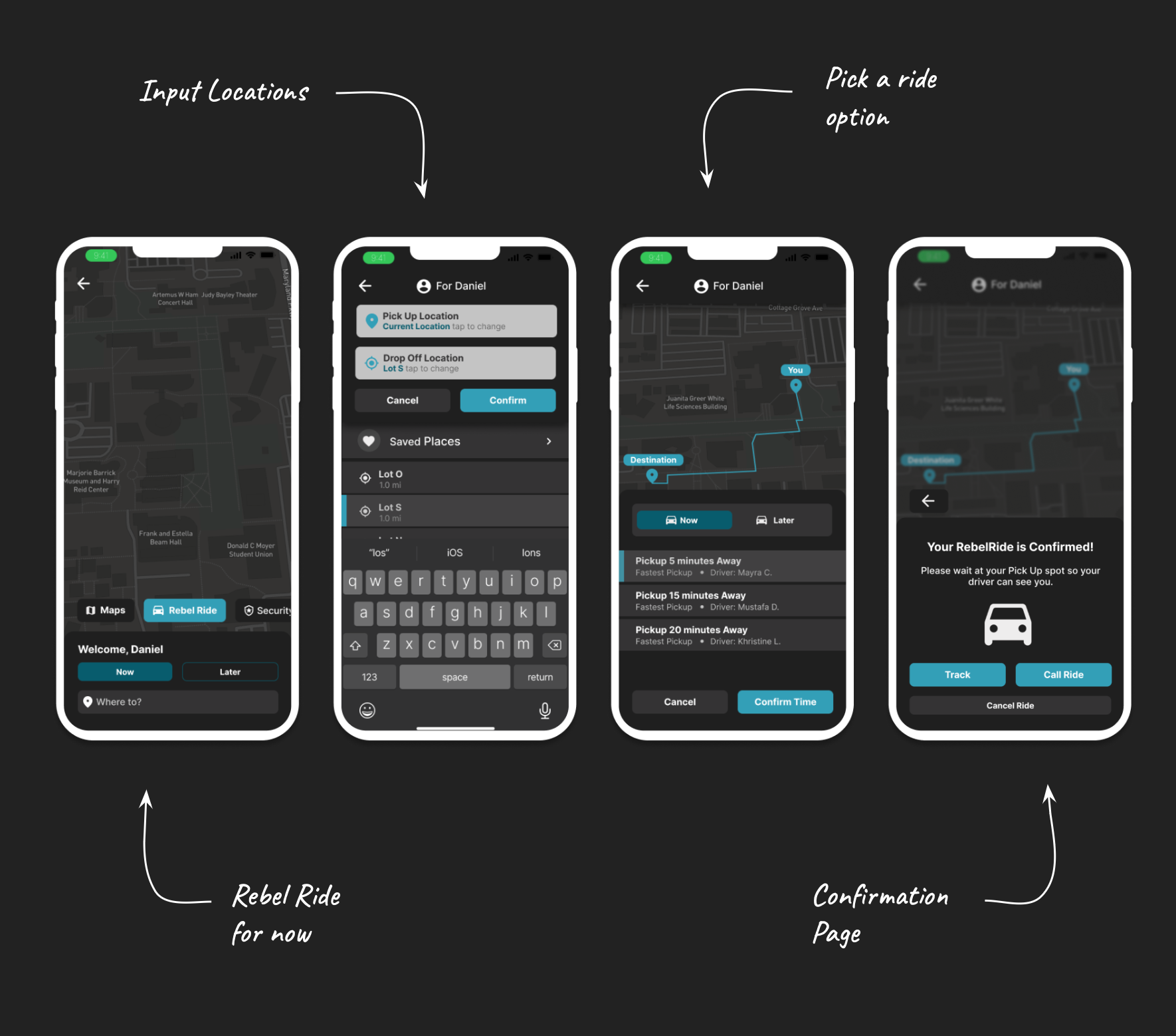
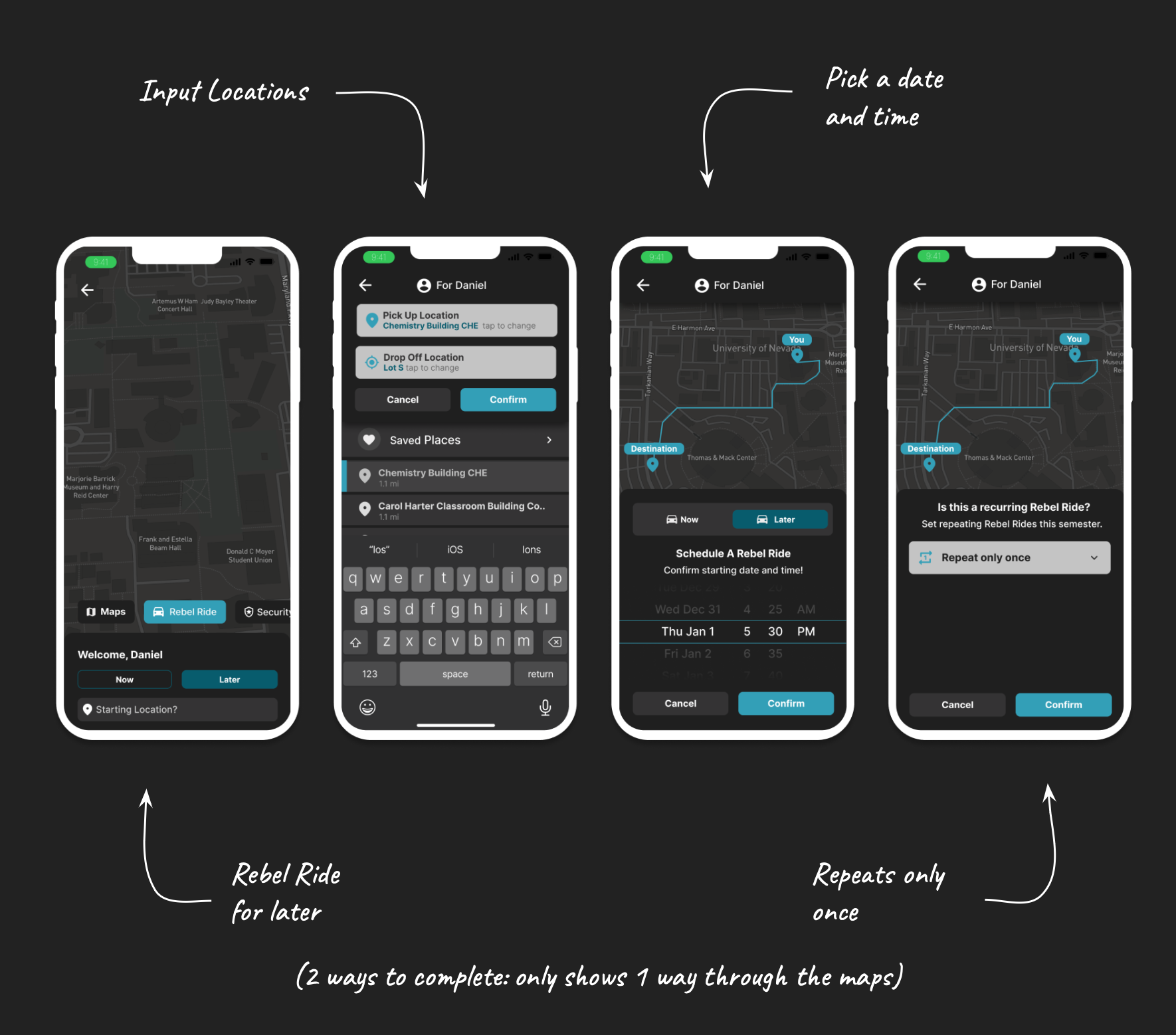
Based on the findings from Prototype 1.0, it was determined to focus on Task B, the scheduling of a Rebel Ride or shared ride, due to its low pass rate. Our prototype 2.0, focused on three tasks for RebelRide:
TAKS A
Call a RebelRide for now.
TAKS B
Schedule a Rebel Ride for later in the Day.
TAKS C
Schedule a recurring Rebel Ride
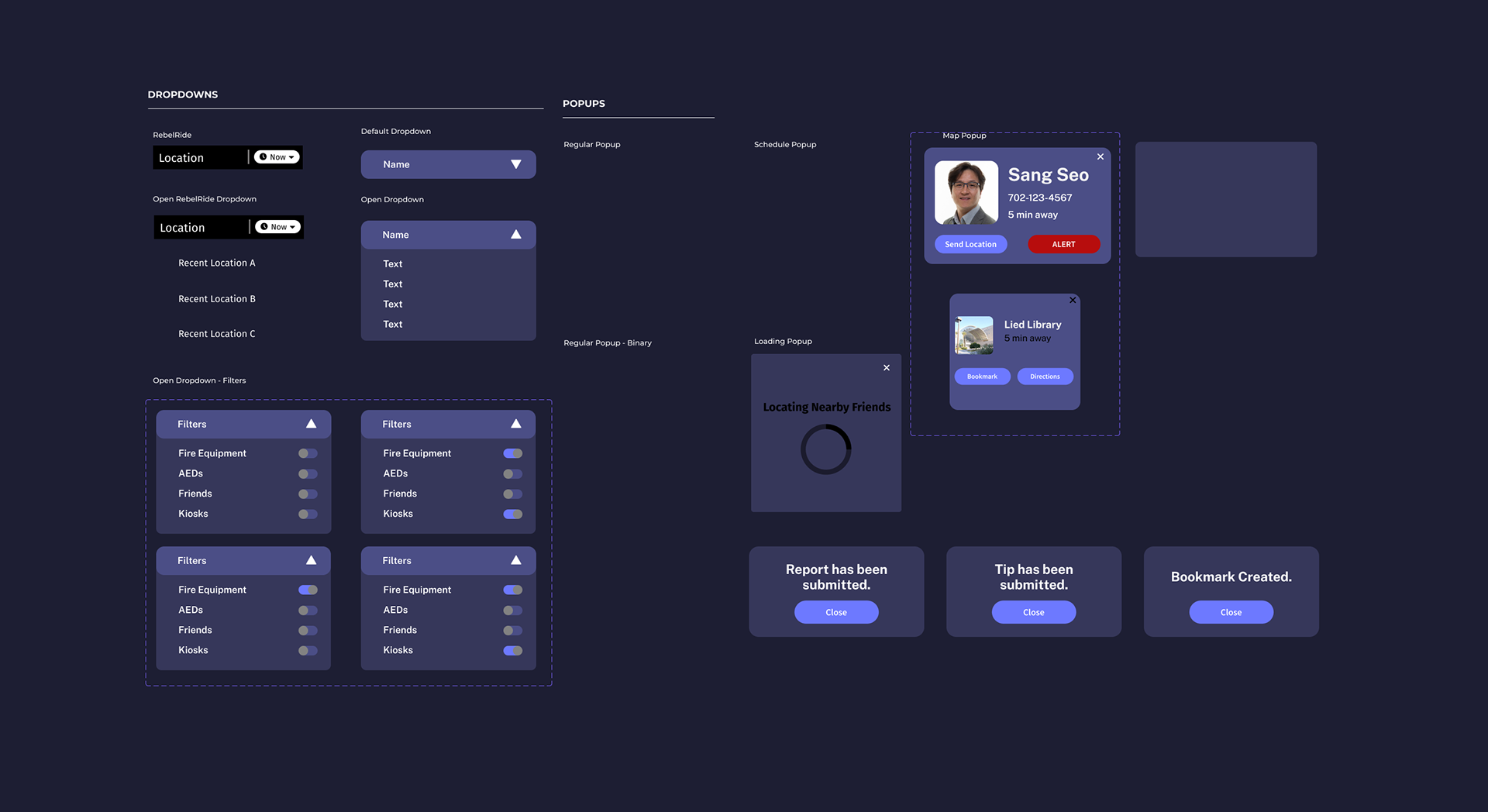
DESIGN SYSTEM 2.0
A new design system was created to keep consistency and improve the hierarchy for the second prototype. Systems for colors, buttons, and secondary and primary input boxes were created.
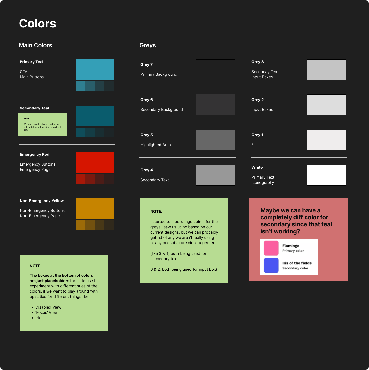
COLORS
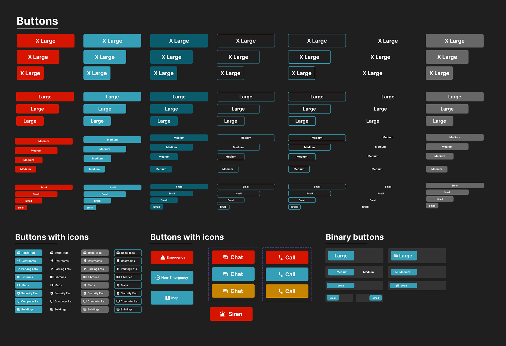
BUTTONS
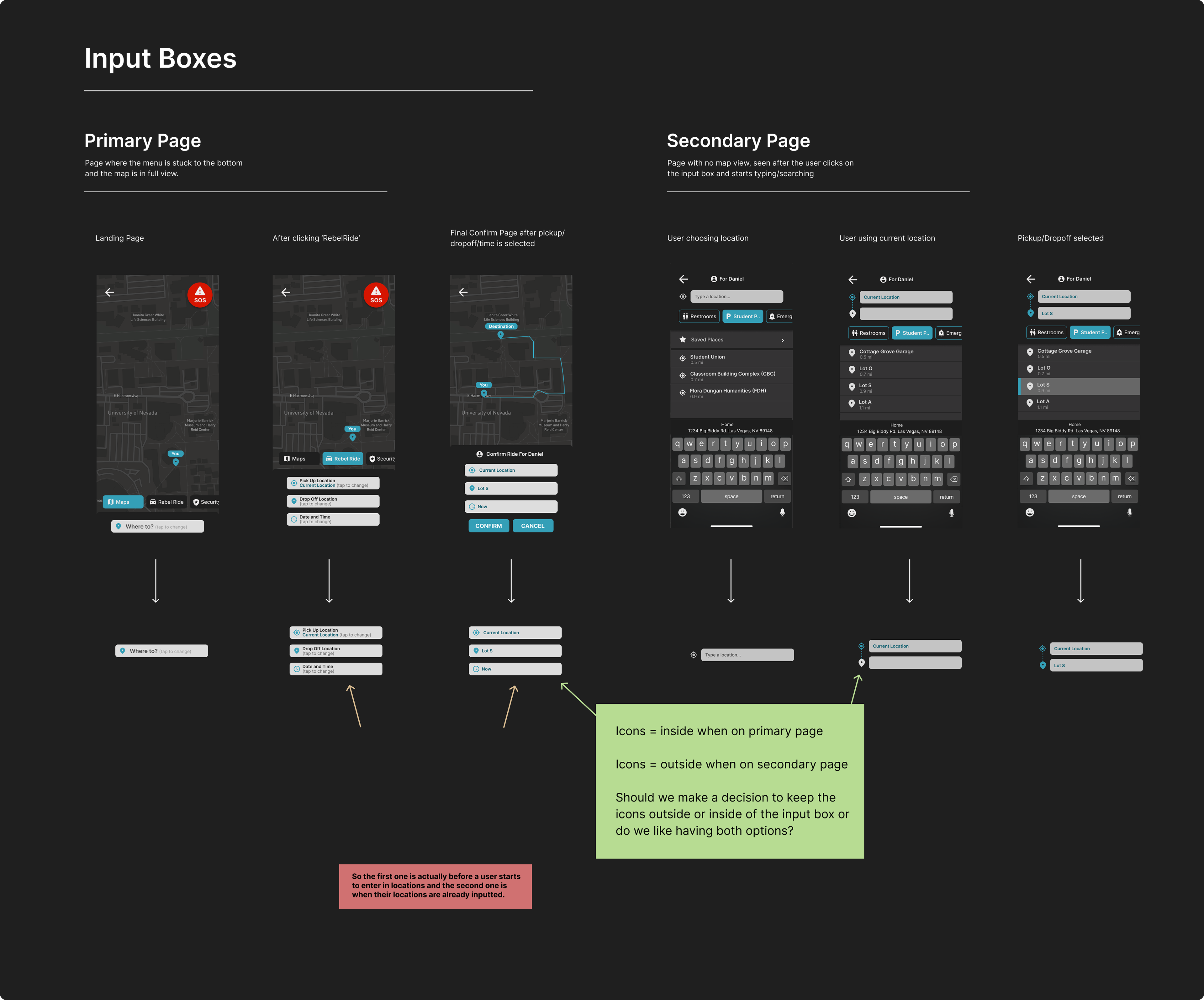
INPUT BOXES
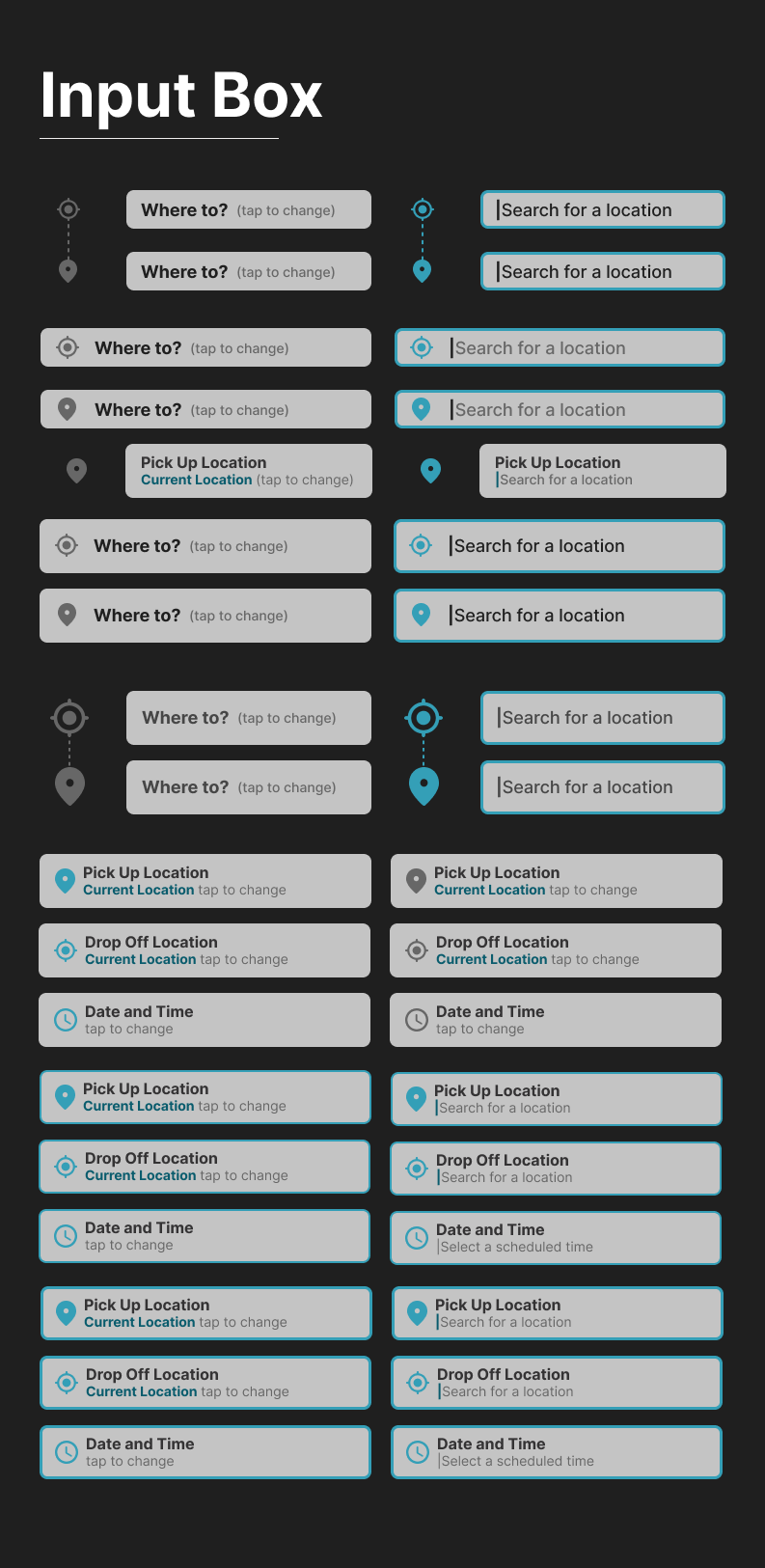
INPUT BOXES CONT
PROTOTYPE CHANGES
Based on the findings from Prototype 1.0, many changes were made to the initial prototype.
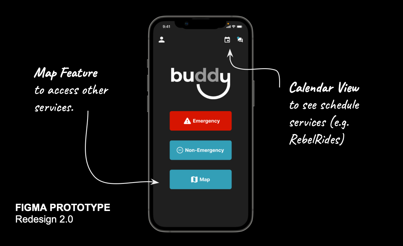
CALENDAR VIEW
Since we are now scheduling services such as Rebel Rides, a calendar view was added.
BOOKMARKING
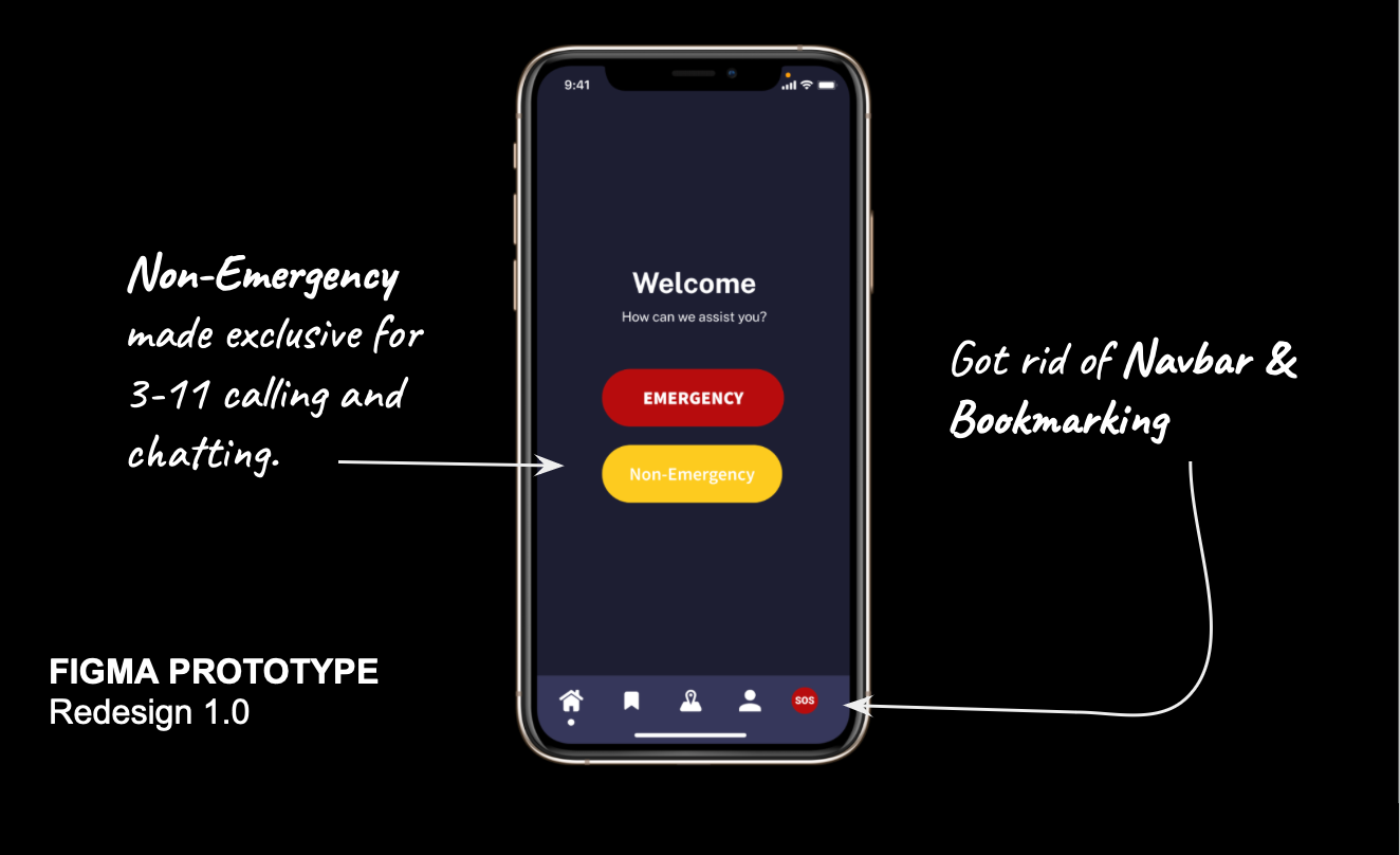
Got rid of the bookmarking feature, which was deemed non-essential during usability testing
NON-EMERGENCY
Based on the first usability test, many participants found the non-emergency feature confusing. Therefore it was made exclusively for calling 3-1-1.
MAP FEATURE
A map feature was added to access other services.
TASK A
Chat with Dispatch Feature.
(Situation) You had to stay late on campus due to your schoolwork. You want to go to your car, but you are afraid to walk there by yourself. Using RebelSafe, request a RebelRide to take you from your current location to Lot S.
TASK B
Schedule a Rebel Ride for later in the Day.
(Situation) It is 1:00 PM and you have a school event to attend at the library and it ends around 8:00 PM. You want to be sure you have a RebelRide setup once the event is over. Using RebelSafe, schedule a RebelRide that will pick you up from the library at 8:00 pm and drop you off at your car in Lot P.
TASK C
Schedule a recurring Rebel Ride
(Situation) Every Tuesday and Thursday, you stay at the Lied Library until 11:30 p.m. Since it’s a long walk, you want to use RebelRide to get to your car. Using RebelSafe, schedule a recurring ride that picks you up from Lied Library and drops you off in Lot P every Tuesday and Thursday at 11:30 p.m.

USABILITY TESTING 2.0
Participants had a greater understanding of the User Flow and a more streamlined user journey.
TASK A
Average Time to Complete: 91.50 seconds
Average Error Clicks: 6 Error Clicks
Total Clicks to Complete Task: 26 Total Clicks
Pass Rate: 100%
TASK B
Average Time to Complete: 57.57 seconds
Average Error Clicks: 3 Error Clicks
Total Clicks to Complete Task: 26 Total Clicks
Pass Rate: 83.30%
TASK C
Average Time to Complete: 56.97 seconds
Average Error Clicks: 5 Error Clicks
Total Clicks to Complete Task: 28 Total Clicks
Pass Rate: 83.30%
CONCLUSION
We found that participants felt more inclined to use the redesigned app because of its straightforward hierarchy and organization, as well as its use of less overwhelming colors.
We hope our design can be beneficial to and adapted by other universities.